
In many of the old books we have the first letter as a large decorative capital. Many times very ornamental typefaces are used. Some examples


Petri Apiani Cosmographia, 1539

Johannes Hevelius Selenographia 1647

Johannes Hevelius Machina celestis
1882

A Letter from Hevelius on observations of a comet, 1683

Sphaera c. 1230 by Sacro Bosco (Ed. published by Peter Apianus, 1526)

FROM GALILEO TO NUCLEAR AGE LEMON 1949

VISUAL ILLUSIONS LUCKIESH 1922
Another style that is often employed with the large capital letter is that the rest of the word, or the sentence is in small caps. Now small caps are distinct than the regular caps. They are capitals, but with the x-height of small letters. And small caps usually have slightly larger spacing between the words than the regular one.

RELATIVITY AND ITS ROOTS HOFFMAN 1983

The Night Thoughts of a Classical Physicist McCormmach 1982

The Pleasure of Text Barthes 1975
Now, even in some of the modern books the same effect is used. So if you are looking for a way to achieve this effect using LaTex, then lettrine is the package you are looking for.
Drop caps
The name of this effect is drop caps. When I was searching for finding a solution for achieving this effect, the first block was that I didn’t know what it was called! After a bit of searching here and there I finally came to know about the name: drop caps. So if you are stuck as I was about what this large capital letter style is called, thence the descriptive and verbose title of post.
Now back to LaTeX implementation. lettering gives you several options for customising the drop caps. For the simplest case, we can use the default font of the document
\usepackage{lettrine}
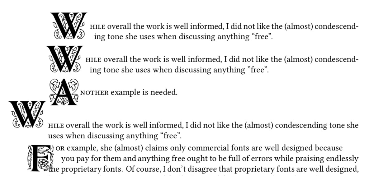
\lettrine{W}{hile} overall the work is well informed, I did not like the (almost) condescending tone she uses when discussing anything “free”.
\lettrine[lines=2,lhang=.1,loversize=0.1]{W}{hile} overall the work is well informed, I did not like the (almost) condescending tone she uses when discussing anything “free”.
\lettrine{A}{nother} example is needed.
\lettrine[lines=1,lhang=1,loversize=0.5]{W}{hile} overall the work is well informed, I did not like the (almost) condescending tone she uses when discussing anything “free”.
\lettrine[lines=3,lhang=0.75,loversize=0.25]{F}{or} example, she (almost) claims only commercial fonts are well designed because
These examples produce the following output

Now we can also use fancy header fonts. Have a look at some of them here.
\newfontfamily\zallman[Scale=4]{ZallmanCaps}
\renewcommand*{\LettrineFont}{\zallman}
\newfontfamily\acorn[Scale=4.2]{AcornInitials}
\renewcommand*{\LettrineFont}{\acorn}

You will need to play with the parameters for different fonts to find a better fit for your document.
Now how to add colour?
\lettrine[lines=3]{\color{red}S}{tart}
\vspace{30pt}
\lettrine{\color{green}W}{hile} overall the work is well informed, I did not like the (almost) condescending tone she uses when discussing anything “free”.
\lettrine[lines=2,lhang=.1,loversize=0.1]{\color{blue}W}{hile} overall the work is well informed, I did not like the (almost) condescending tone she uses when discussing anything “free”.

Happy typesetting!


