Interesting LaTeX Packages – Drawing the Solar System

Many times we need to quickly illustrate the solar system or the planets. Usually we use photos to illustrate the planets. But sometimes the photos can be an over kill. Also to draw the entire solar system is a typical and can be used for illustrative purposes. Though most of the illustrations of the solar system in the school and other text books are horribly out of scale, (with no indication that the figure is not to scale!). For example,  look at the illustration in the Class 6 Science Textbook from NCERT.

A good visualisation will always present a scale, and/or indicate whether the visualisation is to the scale or not. Though in the visualisation above the distances are given, they are not to scale.


Coming back to the topic of our post, a simple way to draw solar system diagram in latex is to use the PStricks package solarsystem. The package can create “Position of the visible planets, projected on the plane of the ecliptic” at a given time and date. This feature might be useful sometimes.

From the package manual:

As we can not represent all the planets in the real proportions, only Mercury, Venus, Earth and Mars are the proportions of the orbits and their relative sizes observed. Saturn and Jupiter are in the right direction, but obviously not at the right distance.
The orbits are shown in solid lines for the portion above the ecliptic and dashed for the portion located below.

The use of the command is very simple, just specify the date of observation with the following parameters, for example:
\SolarSystem[Day=31,Month=12,Year=2020,Hour=23,Minute=59,Second=59]
By default, if no parameter is specified, \SolarSystem gives the configuration day 0 hours to compile.

The resulting output for the above code:

The output also provides the longitude and latitude of the planets at the time given.

Another package that is useful to create free standing planets is the tikz-planets package which we will see next.

Interesting LaTeX Packages – Bohr and Element – electronic orbits and atomic structure

One of the USPs of using LaTeX is the variety of packages that are available to get things done. Some packages will give you special environments to make your documents better, some will help in typesetting or some will help you create graphics or some just provide you with commands for specific symbols. Of course, all these can be done manually by creating your own command, but why reinvent the wheel? There are hundreds of packages at the Comprehensive TeX Archive Network. I have come across many packages that were useful via browsing the packages at CTAN. In this series of posts we will see some packages that are interesting and might be useful. This series of posts is also a sort of personal bookmarking scheme for me. It has happened in the past that I have discovered some interesting LaTeX package, only to forget its existence when I needed its functionality in a project.
In this first post, we will look at two related packages bohr and elements by Clemens Niederberger. The bohr package provides you with a simple functionality to draw the Bohr diagrams for different elements along with electronic configurations.
Load the bohr package by \usepackage{bohr} in the preamble
To use the package simple type the number of electrons and the element symbol. For example, Lithium \bohr{3}{Li} will simply give you

Similarly for other elements
Lithium \bohr{3}{Li}Oxygen \bohr{8}{O}Carbon \bohr{12}{C}Mercury \bohr{80}{Hg}

Now another very useful option in the vohr package is to print the shell-wise electronic configuration for a given element. For example Oxygen \bohr{8}{O} \elconf{O} will give you

This will be a very useful feature when you are writing chemistry or atomic physics texts. Of course you can change the way the shells look.
\setbohr{
shell-options-add = dashed, shell-options-add = red, shell-dist = .75em, nucleus-options-set = {draw=black,fill=orange,opacity=0.5}, electron-options-set = {color=green}, insert-missing}

Mercury\bohr{80}{Hg} \elconf{Hg}

The insert-missing option will give you either the correct number of electrons when the element symbol is given, or  will give you the element symbol when the number of electrons is given. There are more options to explore in the documentation.
Now let us look at the elements package.

This package provides means for retrieving properties of chemical elements like atomic number, element symbol, element name, electron distribution or isotope number.

The package provides atomic number, symbol, name, main isotope and electronic configuration for elements upto 118. For example, just using the atomic number 35 I can get \elementname{35} \elementsymbol{35} \elconf{35}

Having the data accessible in the form of number can be very useful especially if you want to generate tables. The table below from the package documentation was generated by iteratively looping atomic number and invoking commands

\theelement
\elementsymbol{\arabic{element}}
\elementname{\arabic{element}}
\mainelementisotope{\arabic{element}}
\elconf{\arabic{element}}


Making the first letter decorative, large and capital in a text using LaTeX

In many of the old books we have the first letter as a large decorative capital. Many times very ornamental typefaces are used. Some examples

Petri Apiani Cosmographia, 1539

Johannes Hevelius Selenographia 1647

Johannes Hevelius  Machina celestis

1882

A Letter from Hevelius on observations of a comet, 1683

Sphaera c. 1230 by Sacro Bosco (Ed. published by Peter Apianus, 1526)

FROM GALILEO TO NUCLEAR AGE LEMON 1949

example of drop caps from old books

VISUAL ILLUSIONS LUCKIESH 1922

Another style that is often employed with the large capital letter is that the rest of the word, or the sentence is in small caps. Now small caps are distinct than the regular caps. They are capitals, but with the x-height of small letters. And small caps usually have slightly larger spacing between the words than the regular one.

RELATIVITY AND ITS ROOTS HOFFMAN 1983

The Night Thoughts of a Classical Physicist McCormmach 1982

The Pleasure of Text Barthes 1975

Now, even in some of the modern books the same effect is used. So if you are looking for a way to achieve this effect using LaTex, then lettrine is the package you are looking for.

Drop caps

The name of this effect is drop caps. When I was searching for finding a solution for achieving this effect, the first block was that I didn’t know what it was called! After a bit of searching here and there I finally came to know about the name: drop caps. So if you are stuck as I was about what this large capital letter style is called, thence the descriptive and verbose title of post.
Now back to LaTeX implementation. lettering gives you several options for customising the drop caps. For the simplest case, we can use the default font of the document
\usepackage{lettrine}
 
\lettrine{W}{hile} overall the work is well informed, I did not like the (almost) condescending tone she uses when discussing anything “free”. 
\lettrine[lines=2,lhang=.1,loversize=0.1]{W}{hile} overall the work is well informed, I did not like the (almost) condescending tone she uses when discussing anything “free”. 
\lettrine{A}{nother} example is needed.
\lettrine[lines=1,lhang=1,loversize=0.5]{W}{hile} overall the work is well informed, I did not like the (almost) condescending tone she uses when discussing anything “free”. 
  \lettrine[lines=3,lhang=0.75,loversize=0.25]{F}{or} example, she (almost) claims only commercial fonts are well designed because
These examples produce the following output


Now we can also use fancy header fonts. Have a look at some of them here.

\newfontfamily\zallman[Scale=4]{ZallmanCaps}
\renewcommand*{\LettrineFont}{\zallman}


\newfontfamily\acorn[Scale=4.2]{AcornInitials}
\renewcommand*{\LettrineFont}{\acorn}

You will need to play with the parameters for different fonts to find a better fit for your document.
Now how to add colour?
\lettrine[lines=3]{\color{red}S}{tart} 
\vspace{30pt}
\lettrine{\color{green}W}{hile} overall the work is well informed, I did not like the (almost) condescending tone she uses when discussing anything “free”. 
\lettrine[lines=2,lhang=.1,loversize=0.1]{\color{blue}W}{hile} overall the work is well informed, I did not like the (almost) condescending tone she uses when discussing anything “free”.

Happy typesetting!

Forever Free Fonts

There are fonts and there are fonts. One of my earliest recollections of cognising that there are different “fonts” is from a typewritten letter I saw in my childhood (perhaps in the early-mid 90s). Though I didn’t know the term “font” then. Now I had seen typewritten materials earlier, as our exam papers were typewritten. But this said letter was somehow “different”. I didn’t know exactly what was different, but that letter and the typewritten text felt so elegant and aesthetic (again these words I didn’t know then, but trying to reconstruct my feelings from that time) as compared to the other typewritten documents that I had seen. The fact that I still remember that letter implies that it must have had some impact on my mind at that time. After that the printed “text” was never the same. I always tried to “see” the shapes of the text that I would read. Hence I “discovered” that the “fonts” in my school textbooks, and other books are different. I also discovered sans and serif in this way, but didn’t know the terms for them till a few years later. Thus began the journey to look at fonts keenly. Even with my handwriting, I developed 3-4 different scripts. None were cursive. I would play with the slant, then height of the letters, and my fountain pens did play the capable tools. With the computers came in plethora of fonts, more than you could count and keep track of. In the various image editing programmes the fonts achieve prime importance. A good font can make or break a document. It can render something mundane or render it to aesthetic appeal.
A good scientific question to think about is how does our cognitive system recognise that it is the same letter even if it is written in different fonts? Everyone’s handwriting is different even then (if they are legible) we can read and understand what they have written. This would imply that our cognitive system for recognising font faces as particular characters of language must be very very flexible. Any rigidity and we would not communicate. Douglas Hofstadter considers this very question in one of his essays Variations on a Theme as the Crux of Creativity in the Metamagical Themas (an anagram of “Mathematical Games”  by Martin Gardner whose columns Hofstadter replaced) column in Scientific American. The compilation of the columns was later published as a book in 1985.

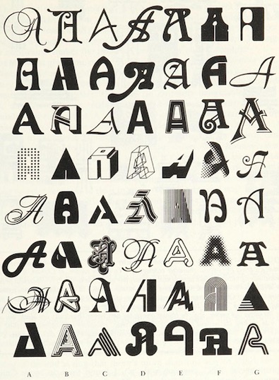
FIGURE 12-3. 56 As in different styles, all drawn from a recent Letraset catalogue. The names of their respective typefaces are given on the facing page. To native readers of the Latin alphabet, it is an almost immediate visual experience to recognize how any one of them is an ‘A’. No conscious processing is required. A couple of these seem far-fetched, but the rest are quite obvious. The most canonical of all 56 is probably Univers (D-3). Note that no single feature, such as having a pointed top or a horizontal crossbar (or even a crossbar at all!) is reliable. Even being open at the bottom is unreliable. What is going on here? p. 243

Hence we have more and more fonts. Some very legible and some not so much.
Though I never somehow liked Times New Roman or Arial, which arguably might be the most popular fonts in documents (how do you find out the most used font?). Might be because they are default fonts on MS Word. One of my earliest, serious documents that I had to prepare on the computer was the project report of my bachelors programme. I did use MS Word, but the font used was Bookman Old Style. And the document did look different than the rest.

I did have a lot of fonts at that point. I installed all fonts that I could get my hands on. Remember this is early 2000, finding free resources on the internet was not easy, and downloading and getting them to your computer was even a bigger an issue (particularly large files). I owe to Viktor Juliet Papa most of my computer knowledge. Because of his mentoring I could muster guts to take out my HDD to cafe where he was the manager, to get downloaded stuff back. (Again only, portable data transfer devices were 3.5 inch floppy drives with 1.44 MB memory. Good luck with transferring 100s of MBs!, my main disk was 8G for reference) So much to risk, but no risk no gain.
Then in that summer during my internship at the University, I discovered LaTeX. And Computer Modern. It looked sooo elegant compared to TNR or Arial. And it had all the mathematical symbols too. At that point, you had to edit the tex file separately, and then compile it via terminal. It would produce a dvi file, which you would convert to postscript via dvi2ps, and then to pdf via ps2pdf. But it was all worth it! The output was divine compared to plebian MS Word. They say LaTeX doesn’t work well for people who have sold their souls! So my report for masters just two years later was in LaTeX. And I never switched back for most serious documents.

In the earliest days, there were very limited fonts in LaTeX. But with packages like XeLaTeX and LuaLaTeX you can use any system fonts in your documents, including non-Roman scripts also. Now there are native packages also which have a variety of fonts. So in my PhD I used Linux Libertine as the main font and associated Linux Biolinum as the Sans font. Wikipedia logo uses Linux Libertine.
 

Now with libertinus package you can use it with pdfLaTeX, no need to use XeLaTeX/LuaLaTeX (though some might find this step regressive). The font  comes with full math support, so that you can write the documents seamlessly.

 
Another nice set of fonts with full math support are kpfonts. Though I do not personally like the default sans that is bundled with it.

And one of the more elegant math fonts is urw-garamond, garamondx with mathdesign. Though this set has licensing restrictions that you may not like.

A sans math variant, that I have used occasionally is the GFS Neohellenic from the Greek Font Society.

These days for most of my Office documents (including google docs) I use EB Garamond for serif. It is too good.

And Quattracento Sans. For monofonts, particularly to be used in text editors (Emacs, I still use Linux Biolinum

in TeXShop I use Average Mono.

Some of the other sans fonts that I do use often are
GeoSans Light, Comfortaa and Josefin Sans.
For fixed width fonts, Latin Modern and Inconsolata, TeX Gyre Cursor are used. See the programming fonts in the list below

 
For handwriting effect there are several nice fonts that I have used. The best ones are Purisa, Comili

Amatic SC is a very elegant font for titles

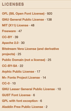
New fonts will be continually developed. And for me fonts being free  (as in freedom) is the most significant aspect. Given this there is a large number of fonts which have been released under GPL, OFL and similar open licenses. Fonts released GPL license come with the font exception. Below is a partial list of free (as in freedom) fonts which you can browse to get the font for your needs (though some might have non-free content). The listing is alphabetical
Arkandis Digital Foundry  Not updated since 2015, but has nice fonts

Font Library (a largish list of Free Fonts with various licenses)

Google Fonts  Several nice fonts, in different scripts too.

LaTeX Font Catalog contains OTF and TTF files as well, my go to site for choosing LaTeX fonts


Lesser Known Programming Fonts
Programming Fonts (check individual licenses)
Let me know any other links to font databases which have free (as in freedom) fonts.
Happy typesetting!

Sidenotes and label in LaTeX

Recently I have been using the sidenotes package in LaTeX. It provides many options which I find aesthetically pleasing. For example, instead of footnotes, it gives sidenotes. This particular typesetting has been used beautifully by Tufte in his books. But even before Tufte’s books this option has been used, for example, see the beautifully designed book The Evolution of Culture in Animals by John. T. Bonner.
bonner
Not the recent reprint, some idiots at Princeton University Press have completely killed the aesthetically pleasing landscaped typesetting to portrait one (and a not very good one)! In general Bonner’s book are a visual treat in terms of designing and of course the content as well. His meticulous detail to the images, and use of log-scales to depict biological scale in time and space it something that I have not seen very often.
The Evolution of Culture in Animals uses a landscape mode with sidenotes and figures in margins extensively. This is the exact functionality that the sidenotes package provides. Even the tufte-book and tufte-handout classes use this package in a modified manner.
When using sidenotes package, I found that the marginfigure and margintable environments worked without a problem when using a label and referring them to in the document. But when it came to the sidecaption option for wider figures and tables, somehow I could not get the referencing to work. The hyperref showed the correct page and even the captions had the correct numbers for tables and figures. But the label and \ref{} to it didn’t work.
For example, if a figure was created as such:

\begin{figure}
\includegraphics[width=0.8\textwidth]{eagle.jpg}
\sidecaption[][1cm]{This is an eagle.}
\label{eagle1}
\end{figure}

The first [] controls the text that appears in the List of Figures, while the second [] controls the vertical placement of the caption.
Now when I referred to this figure in the document using Figure~\ref{eagle1}, it gave an error and typeset it as Figure ??, instead of Figure 1.1 or something similar. The same problem was there for a sidecaption used for tables as well. A common mistake which usually causes this error is placing the label before the caption. So the golden rule seems to be:

Always place your \label{} after the \caption{}.

But it was not the case in my example. A bit of digging in the log file showed this error:


Package caption Warning: \label without proper reference on input line xxx.
See the caption package documentation for explanation.

LaTeX Warning: Reference `eagle1′ on page 7 undefined on input line 415.

Now back to caption package documentation, it had this explanation for this error (page 44):

\label without proper \caption
Regarding \label the floating environments behave differently than its non-floating counter-parts: The internal reference will not be generated at the beginning of the environment, but at \caption instead. So you have to place the \label command either just after or inside the caption text (mandatory argument of \caption).

So that was it. You have to place the \label{} inside the \caption{} environment and the issue was solved. Placing it just after the caption did not work for me.
\begin{figure}
\includegraphics[width=0.8\textwidth]{eagle.jpg}
\sidecaption[][1cm]{This is an eagle.\label{eagle1}}
\end{figure}