I recently have started to refresh my skills with R programming language. I am doing the Harvard Course on Data Science on EdX. I am using R Studio for doing all the exercises. In the second part of the course, Visualisation, which is an area of research interest for me, there is an exercise on stars dataset. But this exercise was available only to those who were crediting the course. Since I was not crediting, but only auditing I left the exercise as it is. But after a week or so I looked at the stars dataset. And thought I should do some explorations on this. For this we have to load the R package dslabs specially designed for this course. This post is detailing the exploratory data analysis with this dataset. (Disclaimer: I have used help from ChatGPT in writing this post for both content and code.)
> library(dslabs)
Once this is loaded, we load the stars dataset
data(stars)
Structure of the dataset
To understand what is the data contained in this data set and how is it structured we can use several ways. The head(stars) command will give use first few lines of the data set.
> head(stars)

star magnitude temp type

1            Sun       4.8 5840    G

2        SiriusA       1.4 9620    A

3        Canopus      -3.1 7400    F

4       Arcturus      -0.4 4590    K

5 AlphaCentauriA       4.3 5840    G

6           Vega       0.5 9900    A
While the tail(stars) gives last few lines of the data set
tail(stars)

star magnitude temp type

91 *40EridaniA 6.0 4900 K

92 *40EridaniB 11.1 10000 DA

93 *40EridaniC 12.8 2940 M

94 *70OphiuchiA 5.8 4950 K

95 *70OphiuchiB 7.5 3870 K

96 EVLacertae 11.7 2800 M
To understand structure further we can use the str(stars) command
> str(stars)

'data.frame':	96 obs. of  4 variables:

$ star     : Factor w/ 95 levels "*40EridaniA",..: 87 85 48 38 33 92 49 79 77 47 ...

$ magnitude: num  4.8 1.4 -3.1 -0.4 4.3 0.5 -0.6 -7.2 2.6 -5.7 ...

$ temp     : int  5840 9620 7400 4590 5840 9900 5150 12140 6580 3200 ...

$ type     : chr  "G" "A" "F" "K" ...
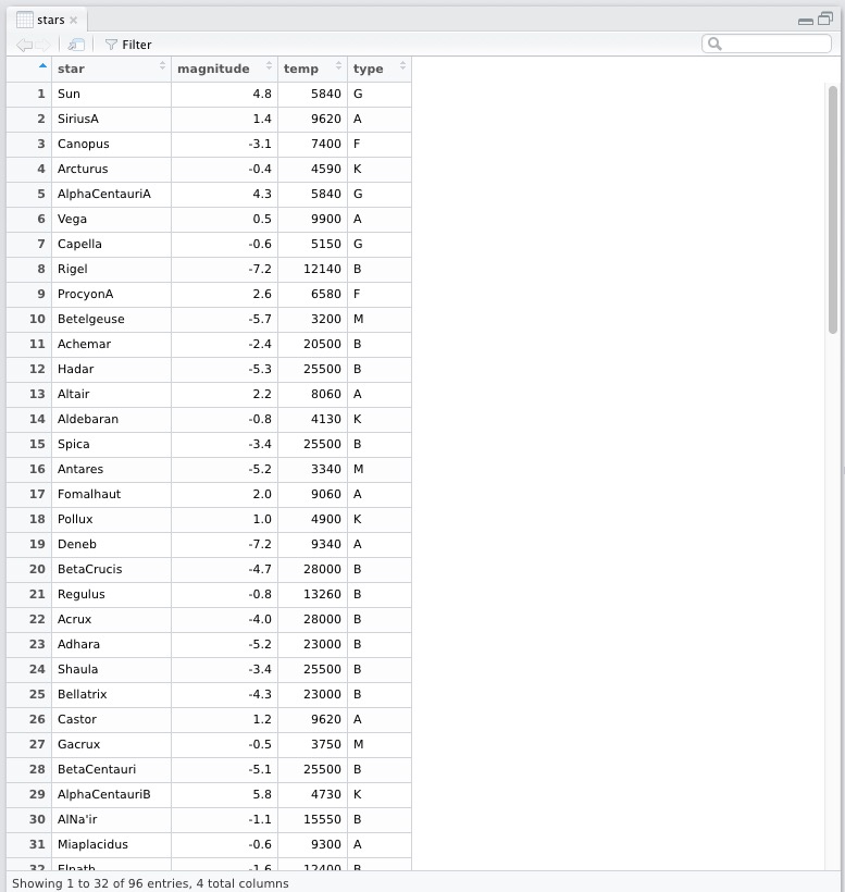
In RStudio we can also see the data with View(Stars) function in a much nicer (tabular) way. It opens up the data in another frame as shown below.

Thus we see that it has 96 observations with four variables, namely star, magnitude, temp and type. The str(stars) command also tells use the datatype of the columns, they are all different: factor, num, int, chr. Let us understand what each of the column represents.
Name of stars
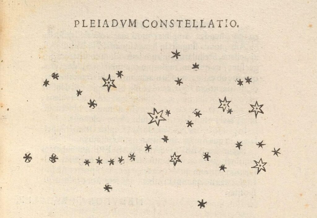
The star variable has the names of the stars as seen in the table above. Many of the names are of ancient and mythological origins, while some are modern. Most are of Arabic origin, while few are from Latin. Have a look at Star Lore of All Ages by William Olcott to know some of the mythologies associated with these names. Typically the alphabets after the star names indicate them being part of a stellar system, for example Alpha Centauri is a triple star system. The nomenclature is such that A represents the brightest member of the system, B the second brightest and so on. Also notice that some names have Greek pre-fixes, as in the case of of Alpha Centauri. This Greek letter scheme was introduced by Bayer in 1603 and is known as Bayer Designation. The Greek letters denote the visual magnitude or brightness (we will come to the meaning of this next) of the stars in a given constellation. So Alpha Centuari would mean the brightest star in the Centaurus constellation. Before invention of the telescope the number of stars that are observable were limited by the limits of human visual magnitude which is about +6. With invention of telescope and their continuous evolution with increasing light gathering power, we discovered more and more stars. Galileo is the first one to view new stars and publish them in his Sidereal Messenger. He shows us that seen through the telescope, there are many more stars in the Pleiades constellation than can be seen via naked eyes (~+6 to max +7 with about 4200 stars possibly visible).

Soon, so many new stars were discovered that it was not possible to name them all. So coding of the names begun. The large telescopes which were constructed would do a sweep of the sky using big and powerful lenses and would create catalogue of stars. Some of the names in the data set indicate these data sets, for example HD denotes Henry Draper Catalogue.
Magnitudes of stars
Now let us look at the other three columns present us with observations of these stars. Let us understand what they mean. The second column represents magnitude of the stars. The stellar magnitude is of two types: apparent and absolute. The apparent magnitude is a measure of the brightness of the star and depends on its actual brightness, distance from us and any loss of the brightness due to intervening media. The magnitude scale was devised by Claudius Ptolemy in second century. The first magnitude stars were the brightest in the sky with sixth being the dimmest. The modern scale follows this classification and has made it mathematical. The scale is reverse logarithmic, meaning that lower the magnitude, brighter is the object. A magnitude difference of 1.0 corresponds to a brightness ratio of $ \sqrt[5]{100} $ or about 2.512. Now if you are wondering why the magnitude scale is logarithmic, the answer lies in the physiology of our visual system. As with the auditory system, our visual system is not linear but logarithmic. What this means is that if we perceive an object to be of double brightness of another object, then their actual brightness (as measured by a photometer) are about 2.5. This fact is encapsulated well in the Weber-Fechnar law. The apparent magnitude of the Sun is about -26.7, it is after all the brightest object in the sky for us. Venus, when it is brightest is about -4.9. The apparent magnitude of Neptune is +7.7 which explains why it was undiscovered till the invention of the telescope.
But looking at the table about the very first entry lists Sun’s magnitude as +4.8. This is because the dataset contains the absolute magnitude and not the apparent magnitude. Absolute magnitude is defined as “apparent magnitude that the object would have if it were viewed from a distance of exactly 10 parsecs (32.6 light-years), without dimming by interstellar matter and cosmic dust.” As we know, the brightness of an object is inversely proportional to square of the distance (inverse square law). Due to this fact very bright objects can appear very dim if they are very far away, and vice versa. Thus if we place the Sun at a distance of about 32.6 light years it will be not-so-bright and will be an “average” star with magnitude +4.8. The difference in these two magnitudes is -31.57 and this translates to huge brightness difference of 3.839 $\times$ 1012. And of course this definition does not take into account the interstellar matter which further dims the stars. Thus to find the absolute magnitude of the stars we also need to know their distance. This is possible for some nearby stars for which the parallax has been detected. But for a vast majority of stars, the parallax is too small to be detected because they are too faraway. The distance measure parsec we saw earlier is defined on basis of parallax, one parsec is the distance at which 1 AU (astronomical unit: distance between Earth and Sun) subtends an angle of one arcsecond or 1/3600 of a degree.
Thus finding distance to the stars is crucial if we want to know their actual magnitudes. For finding the cosmic distances various techniques are used, we will not go into their details. But for our current purpose, we know that the stars dataset has absolute magnitudes of stars. The range of magnitudes in the dataset is
> range(stars$magnitude)

[1] -8 17
Thus stars in the dataset have a difference of 25 magnitudes, that is a brightness ratio of 105! Which are these brightest and dimmest stars? And how many stars of each magnitude are there in the data set? We can answer these type of questions with simple queries to our dataset. For starters let us find out the brightest and dimmest stars in the dataset. Each row in the dataset has an index, which is the first column in the table from RStudio above. Thus if we were to write:
> stars[1]
it will give us all the entries of the first column,
star

1 Sun

2 SiriusA

3 Canopus

4 Arcturus

5 AlphaCentauriA

6 Vega

7 Capella

8 Rigel

9 ProcyonA

10 Betelgeuse

...

...
But if we want only a single row, instead of a column, we have to tell that by keeping a , in the index 1. Thus for the first row we write
> stars[1,]

> star magnitude temp type

1 Sun 4.8 5840 G
Thus to find the brightest or dimmest star we will have to find its index and then we can find its name from the corresponding column. So how do we do that? For this we have functions which.max and which.min, we use them thus:
> which.max(stars$magnitude)

[1] 76
We feed this to the dataset and get
> stars[76,]

star magnitude temp type

76 G51-I5 17 2500 M
This can also be done in a single line
> stars[which.min(stars$magnitude), ]

star magnitude temp type

45 DeltaCanisMajoris        -8 6100    F
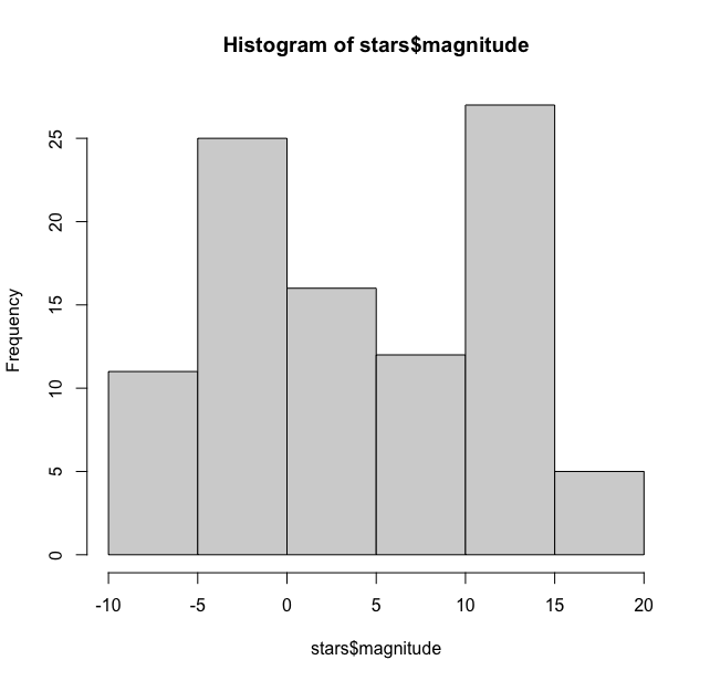
Now let us check the distribution of these magnitudes. The simplest way to do this is to create a histogram using the hist function.
hist(stars$magnitude)
This gives the following output

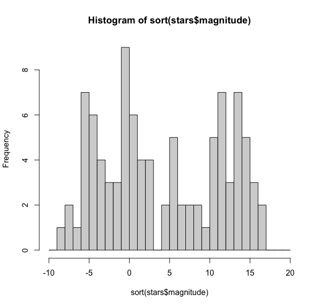
As we can see it has by default binned the magnitudes in bins of 5 units and the distribution here is bimodal with one peak between -5 and 0 and another peak between 10 and 15. We can tweak the width of the bars to get a much finer picture of the distribution. For this hist function has option to add breaks manually. We have used the seq function here ranging from -10 to 20 in steps of 1.
> hist(stars$magnitude, breaks = seq(-10, 20, by = 1))
And this gives us:

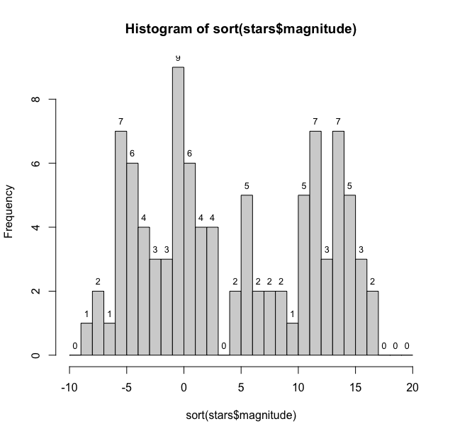
Thus we see that the maximum number of stars (9) are at -1 magnitude and three magnitudes have one star each while +3 magnitude doesn’t have any stars. This histogram could be made more reader friendly if we can add the count on the bars. For this we need to get some coordinates and numbers. We first get the counts
mag_data <- hist(stars$magnitude, breaks = seq(-10,20, 1), plot = FALSE)
This will give us the actual number of counts
> [1] 0 1 2 1 7 6 4 3 3 9 6 4 4 0 2 5 2 2 2 1 5 7 3 7 5 3 2 0 0 0
Now to place them at the middle of the bars of histogram we need midpoints of the bars, we use mag_data$mids to find them and mag_data_counts for the count for labels.
> text(mag_data$mids, mag_data$counts, labels = mag_data$counts, pos = 3, cex = 0.8, col = "black")
To get the desired graph

Thus we have a fairly large distribution of stellar magnitudes.
Now if we ask ourselves this question How many stars in this dataset are visible to the naked eye? What can we say? We know that limiting magnitude for naked eye is +6. So, a simple query should suffice:
count(stars %>% filter(magnitude <= 6))

n

1 57
(Here we have used the pipe function %>% to pass on data from one argument to another from the dplyr pacakge. This query shows that we have 57 stars which have magnitude less than or equal to 6. Hence these many should be visible… But wait it is the absolute magnitude that we have in this dataset, so this question itself cannot be answered unless we have the apparent magnitudes of the stars. Though computationally correct, this answer has no meaning as it is cannot be treated same as the one with apparent magnitude which we experience while watching the stars.
Temperature of Stars
The third column in the data set is the temp or the temperature. Now, at one point in the history of astronomy people believed that we would never be able to understand the structure or the content of the stars. But the invention of spectroscopy as a discipline and its application to astronomy made this possible. With the spectroscope applied to the end of the telescope (astronomical spectroscopy), we could now understand the composition of the stars, their speed and their temperature. The information for the composition came from the various emission and absorption lines in the spectra of the stars, which were then compared with similar lines produced in the laboratory by heating various elements. Helium was first discovered in this manner: first in the spectrum of the Sun and then in the laboratory. For detailed story of stellar spectroscopy one can see the book Astronomical Spectrographs and Their History by John Hearnshaw. Though an exact understanding of the origin of the spectral line came only after the advent of quantum mechanics in early part of 20th century.

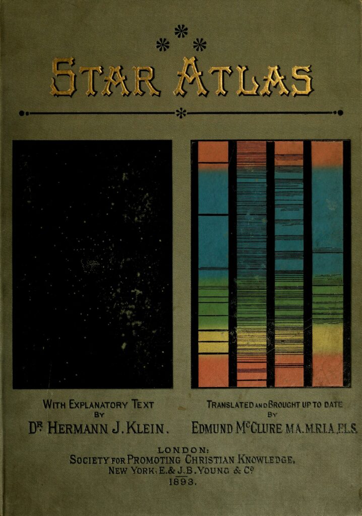
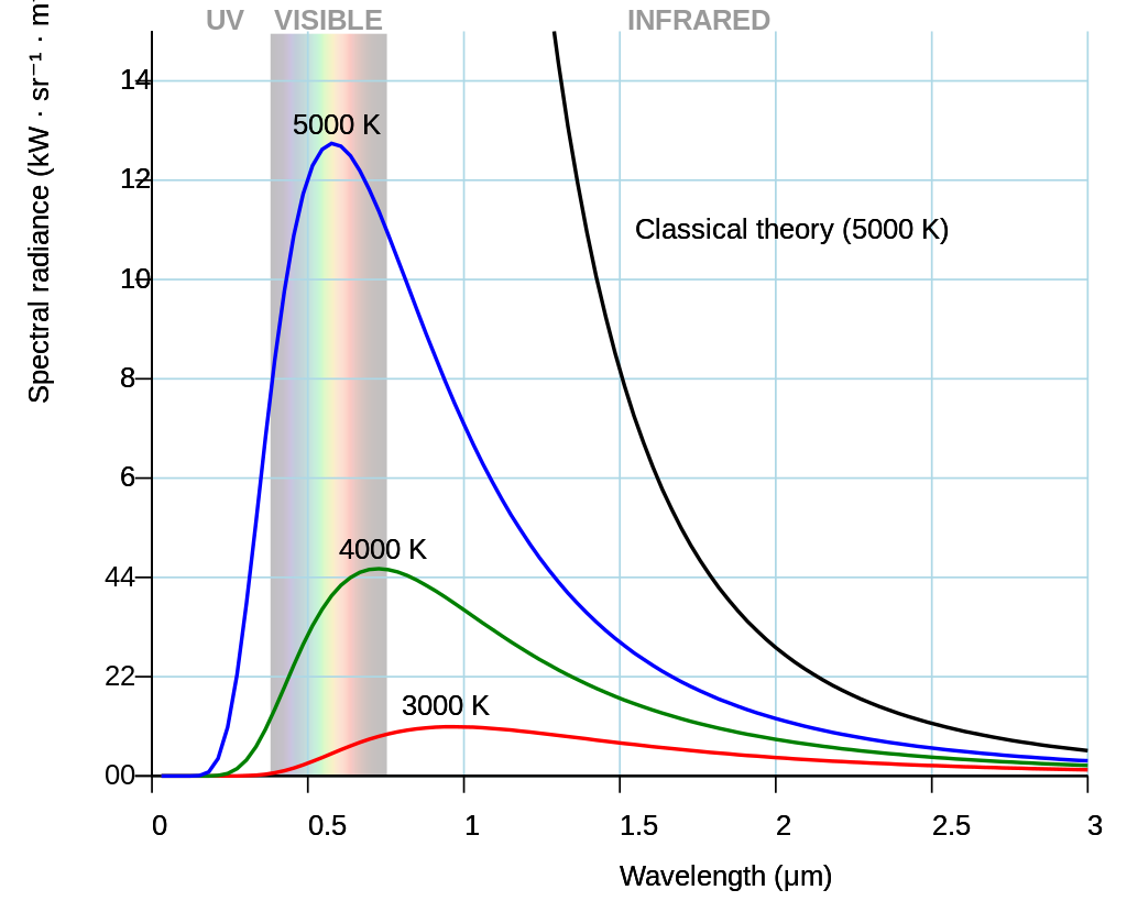
But the spectrum also tells us about the surface temperature of the stars. How this is so? For this we need to invoke one of the fundamental ideas in physics: the blackbody radiation. Now if we find the intensity of radiation from a body at different wavelengths (or frequencies) we get a curve. This curve is typical and for different temperatures we get unique curves (they don’t intersect). Of course this is true for an ideal blackbody which is an idealized opaque, non-reflective body. Stellar spectrum is like that of an ideal blackbody, this continuous spectrum is punctuated with absorption and emission lines as shown in the book cover above.

The frequency or wavelength at which the radiation has maximum intensity (brightness/luminosity) is related to the temperature of the body, typical curves are shown as above. Stars behave almost as ideal black bodies. Notice that as the temperature of the body increases the peak radiation wavelength increases (frequency is reduced) as shown in the diagram above. These relationships are given by the formula
$$
L = 4 \pi R^{2} \sigma T^{4}
$$
where $L$ is the luminosity, $R$ is the radius, $\sigma$ is Stephan’s constant and $T$ is the temperature. This equation tells us that $L$ is much more dependent on the $T$, so hotter stars would be more brighter.
It was failure of the classical ideas of radiation and thermodynamics to explain the nature of blackbody radiation that led to formulation of quantum mechanics by Max Planck in the form of Planck’s law for quantisation of energy. For a detailed look at the history of this path breaking episode in history of science one of the classics is Thomas Kuhn’s Black-Body Theory and the Quantum Discontinuity, 1894—1912.
That is to say hotter bodies have shorter peak frequencies. In other words, blue stars are hotter than the red ones. (Our hot and cold symbolic colours on the plumbing peripherals needs to change: we have it completely wrong!) Thus the spectrum of the stars gives as its absolute temperature, along with all other information that we can obtain from the stars. The spectrum is our only source of information for stars. This is what is represented in the third column of our data. For our dataset the range of stellar temperatures we have a wide range of temperatures.
range(stars$temp)

[1]  2500 33600
Let us explore this column a bit. If we plot a histogram with default options we get:
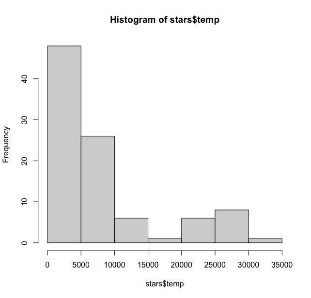
> hist(stars$temp)

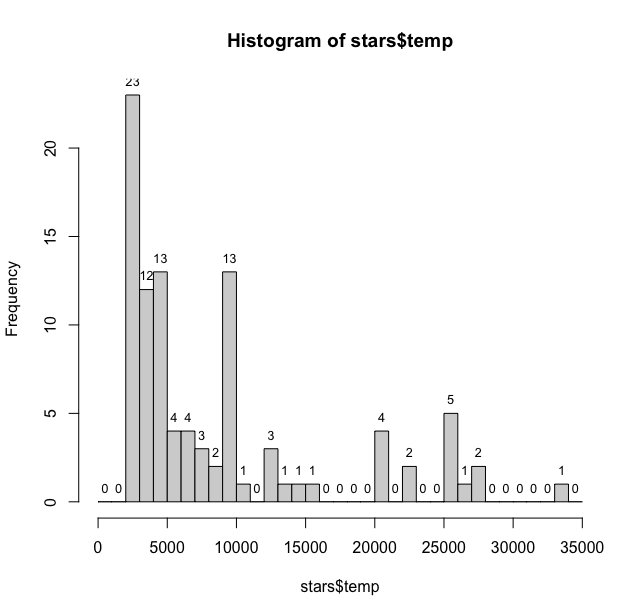
This is showing maximum stars have a temperature below 10000. We can bin at 1000 and add labels to get a much better sense. Which star has 0 temperature??
hist(stars$temp, breaks = seq(0,35000, 1000))

> temp_data <- hist(stars$temp, breaks = seq(0,35000, 1000), plot = FALSE)

> text(temp_data$mids, temp_data$counts, labels = temp_data$counts, pos = 3, cex = 0.8, col = "black")

This plot gives us much better sense of the distribution of stellar temperatures. With most of the temperatures being in 2000-3000 degrees Kelvin range. The table() function also provides useful information about distribution of temperatures in the column.
> table(stars$temp)
2500 2670 2800 2940 3070 3200 3340 3480 3750 3870 4130 4590

1 10 7 5 1 3 4 1 1 2 3 3

4730 4900 4950 5150 5840 6100 6580 6600 7400 7700 8060 9060

1 5 1 2 2 2 1 1 2 1 2 1

9300 9340 9620 9700 9900 10000 11000 12140 12400 13000 13260 14800

1 2 3 1 4 1 1 1 1 1 1 1

15550 20500 23000 25500 26950 28000 33600

1 4 2 5 1 2 1
While the summary() function provides the basic statistics:
> summary(stars$temp)

Min. 1st Qu.  Median    Mean 3rd Qu.    Max.

2500    3168    5050    8752    9900   33600
Type of Stars
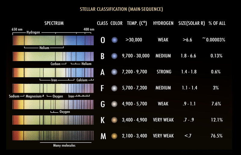
The fourth and final column of our data is type. This category of data is again based on the spectral data of stars and is type of spectral classification of stars. “The spectral class of a star is a short code primarily summarizing the ionization state, giving an objective measure of the photosphere’s temperature. ” The categories of the type of stars and their physical properties are summarised in the table below. The type of stars and their temperature is related, with “O” type stars being the hottest, while “M” type stars are the coolest. The Sun is an average “G” type star.

There are several mnemonics that can help one remember the ordering of the stars in this classification. One that I still remember from by Astrophysics class is Oh Be A Fine Girl/Guy Kiss Me Right Now. Also notice that this “type” classification is also related to size of the stars in terms of solar radius.
In our dataset, we can see what type of stars we have by
> stars$type

[1] "G" "A" "F" "K" "G" "A" "G" "B" "F" "M" "B" "B" "A" "K"

[15] "B" "M" "A" "K" "A" "B" "B" "B" "B" "B" "B" "A" "M" "B"

[29] "K" "B" "A" "B" "B" "F" "O" "K" "A" "B" "B" "F" "K" "B"

[43] "B" "K" "F" "A" "A" "F" "B" "A" "M" "K" "M" "M" "M" "M"

[57] "M" "A" "DA" "M" "M" "K" "M" "M" "M" "M" "K" "K" "K" "M"

[71] "M" "G" "F" "DF" "M" "M" "M" "M" "K" "M" "M" "M" "M" "M"

[85] "M" "DB" "M" "M" "A" "M" "K" "DA" "M" "K" "K" "M"
Our Sun is G-type star in this classification (first entry). If we use the table() function on this column we get the frequency of each type of star in the dataset.
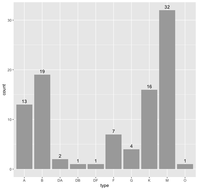
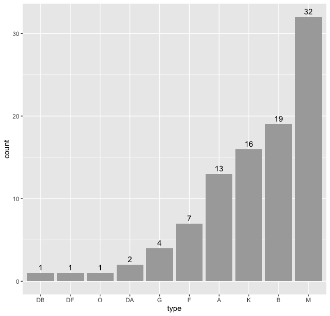
> table(stars$type)
A B DA DB DF F G K M O
13 19 2 1 1 7 4 16 32 1
And to see a barplot of this table we will use ggplot2() package. Load the package using library using library(ggplot2) and then
> stars %>% ggplot(aes(type)) + geom_bar() + geom_text(stat = "count", aes(label = after_stat(count)), vjust = -0.5, size = 4)

Thus we see that “M” type stars are the maximum in our dataset. But we can do better, we can sort this data according the frequency of the types. For this we use the code:
> type_count <- table(stars$type) > # count the frequencies

> sorted_type <- names(sort(type_count)) > # sort them

> stars$type <- factor(stars$type, levels = sorted_type) > # reorder them with levels and plot them

> stars %>% ggplot(aes(type)) + geom_bar(fill = "darkgray") +  geom_text(stat = "count", aes(label = after_stat(count)), vjust = -0.5, size = 4)
And we get

To plot HR Diagram
Now, given my training in astronomy and astrophysics, the first reaction that came to my mind after seeing this data was this is the data for the HR Diagram! The HR diagram presents us with the fundamental relationship of types and temperature of stars. This was an crucial step in understanding stellar evolution. The intials HR stand for the two astronomers who independently found this relationship: The diagram was created independently in 1911 by Ejnar Hertzsprung and by Henry Norris Russell in 1913.
By early part of 20th century several star catalogues had been around, but nothing stellar evolution or structure was known. The stellar spectrographs revealed what elements were present in the stars, but the energy source of the stars was still an unresolved question. Classical physics had no answer to this fundamental question about how stars were able to create so much energy (for example, see Stars A Very Short Introduction by James Kaler on the idea that charcoal powers the Sun by Lord Kelvin). Added to this was the age of the stars, from geological data and idea of geological deep time, the Sun was estimated to be 4 billion years old as was the Earth. So stars had been producing so much energy for such a long time! But that is not the point of this post, the HR diagram definitely helped the astronomers think about the idea that stars might not be static but evolve in time. The International Astronomical Union conducted a special symposium titled The HR Diagram in 1977. The proceedings of the symposium have several articles of interest on the history of creation and interpretation of the HR Diagram.
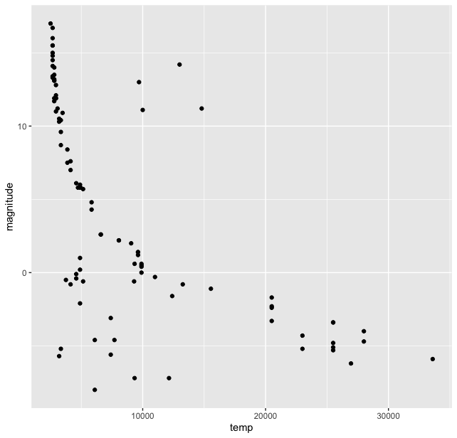
I think it was but natural that astronomers tried to find correlations between various properties of thousands of stars in these catalogues. And when they did they find a (co-)relationship between them. The HR diagram exists in many versions, but the basic idea is to plot the absolute magnitude and temperature (or colour index). Let us plot these two to see the co-relation, for this we again use the ggplot2() pacakge and its scatterplot function geom_point().
> stars %>% ggplot(aes(temp, magnitude)) + geom_point()
This gives us the basic plot of HR diagram.

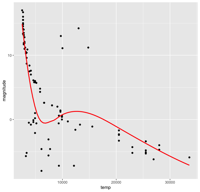
Immediately we can see that the stars are not randomly scattered on this plot, but are grouped in clusters. And most of them lie in a “band”. Though there are outliers at the lower temperature and magnitude range and high magnitude and temperature around 10-15 thousand range. We see that most stars lie in a band which is called the “Main Sequence”. We can try to fit a function here in this plot using some options in the ggplot() library, we use geom_smooth() function for this and get:
stars %>% ggplot(aes(temp, magnitude)) + geom_point() + geom_smooth( se = FALSE, color = “red”)

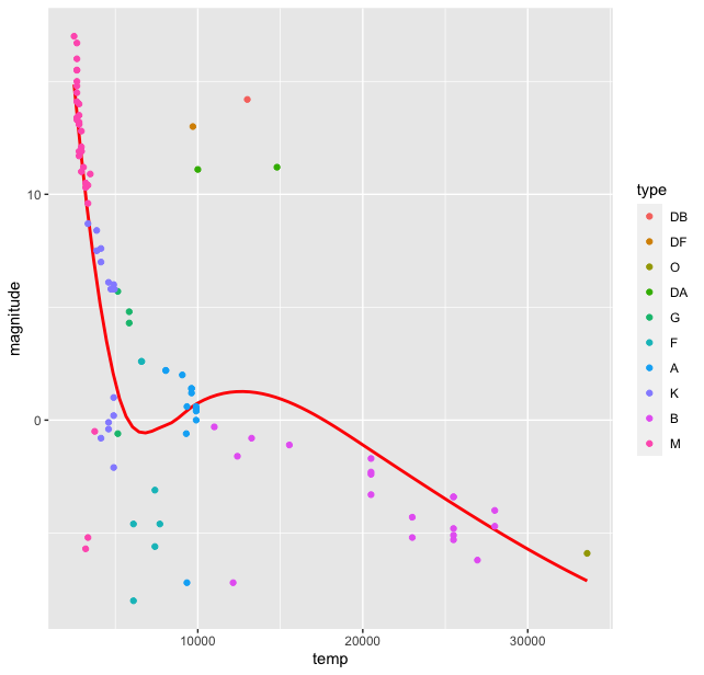
Of course this smooth curve is a very crude (perhaps wrong?) approximation of the data, but it certainly points us towards some sort of correlation between the two quantities for most of the stars. But wait, we have another categorical variable in our dataset, the type of stars. How are the different types of stars distributed on this curve? For this we introduce type variable in the aesthetics argument of ggplot() to colour the stars on our plot according to this category:
> stars %>% ggplot(aes(temp, magnitude, color = type)) + geom_smooth( se = FALSE, color = "red") + geom_point()
This produces the plot

Thus we see there is a grouping of stars by the type. Of course the colours in the palette here are not the true representatives of the star colours. The HR diagram was first published around 1911-13, when quantum mechanics was in its nascent stages. The ideas of Rutherford’s model were still extant and was just out. The fact that this diagram indicated a relationship between the magnitude and temperature, led to thinking about stellar structure itself and its ways of producing energy with fundamentally new ideas about matter and energy from quantum mechanics and their transformation from relativistic physics. But that is a story in future. For now, let us come to our HR diagram. From the dataset we have one more variable, the star name which could be used in this plot. We can name all the stars in the plot (there are only 96). For this we use the geom_text() function in ggplot()
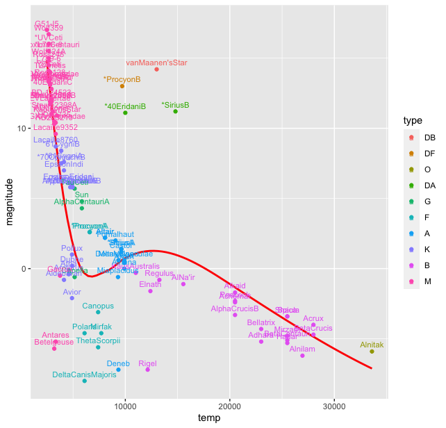
> stars %>% ggplot(aes(temp, magnitude, color = type), label = star) + geom_smooth( se = FALSE, color = "red") + geom_point() + geom_text((aes( label = star)), nudge_y = 0.5, size = 3)
This produces a rather messy plot, where most of the starnames are on top of each other and not readable:

To overcome this clutter we use another package ggrepel() with the following code:
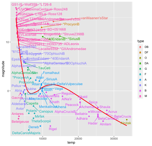
> stars %>% ggplot(aes(temp, magnitude, color = type), label = star) + geom_smooth( se = FALSE, color = "red") + geom_text_repel(aes(label = star))
This produces the plot with the warning "Warning message: ggrepel: 13 unlabeled data points (too many overlaps). Consider increasing max.overlaps ". To overcome this we increase the max.overlaps to 50.
> stars %>% ggplot(aes(temp, magnitude, color = type), label = star) + geom_point() + geom_smooth( se = FALSE, color = "red") + geom_text_repel(aes(label = star), max.overlaps = 50)

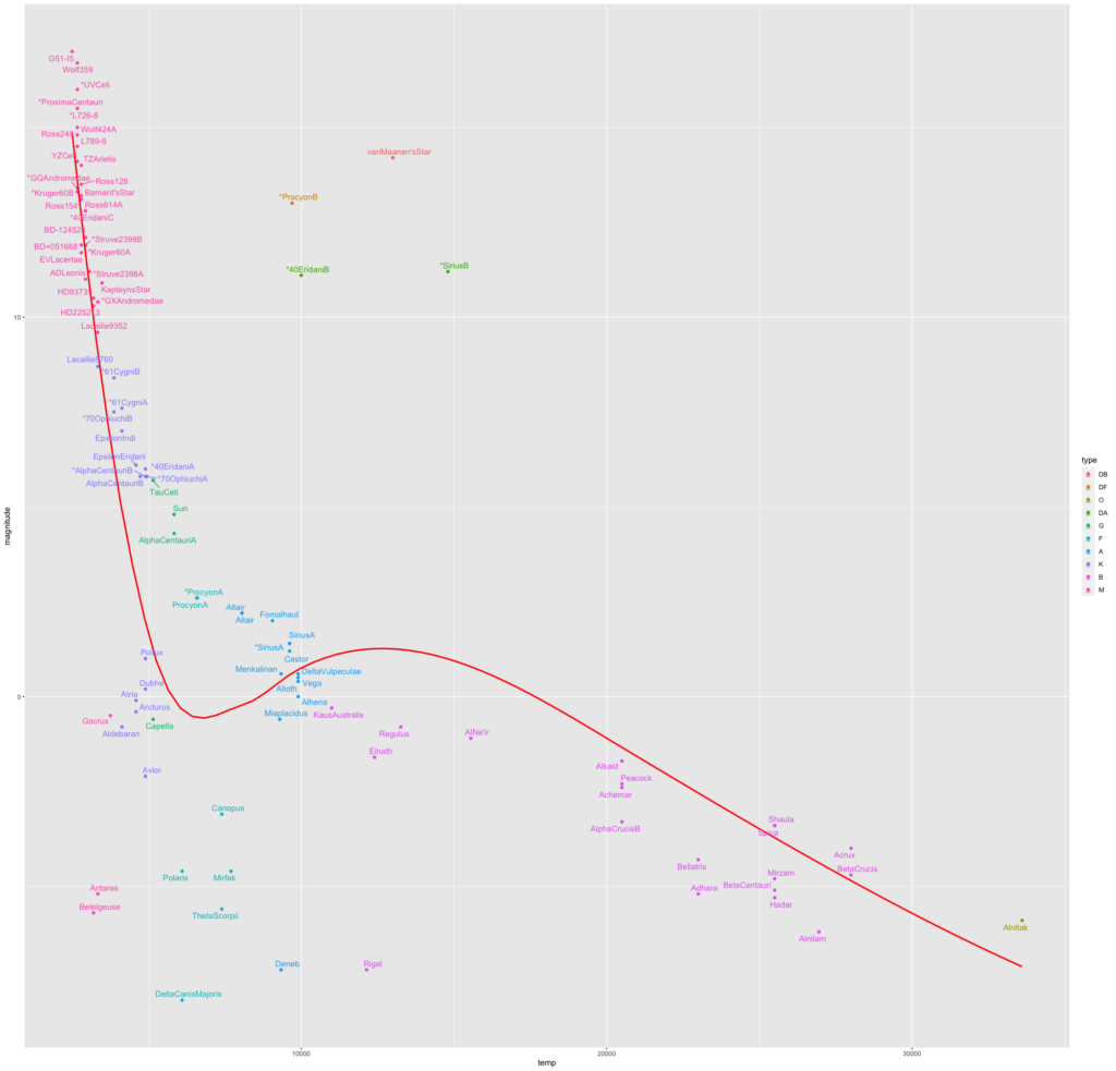
This still appears cluttered a bit, scaling the plot while exporting gives this plot, though one would need to zoom in to read the labels.

Of course with a different data set, with larger number and type of stars we would see slightly different clustering, but the general pattern is the same.
We thus see that starting from the basic data wrangling we can generate one of the most important diagrams in astrophysics. I learned a lot of R in the process of creating this diagram. Next task is to

