Emphasis

emphasis | ˈɛmfəsɪs | noun (plural emphases | ˈɛmfəsiːz | ) [mass noun]

1 special importance, value, or prominence given to something: they placed great emphasis on the individual’s freedom | [count noun] : different emphases and viewpoints

2 stress given to a word or words when speaking to indicate particular importance: inflection and emphasis can change the meaning of what is said

vigour or intensity of expression: he spoke with emphasis and with complete conviction

Emphasis on something means that we want to highlight it from the rest. A common way to do this in text is to italicize or give a boldface or even underline the text. At times colour is added to text to highlight it or colour is added to the background of the text. All these elements of typography work when there is a common background against which these elements standout. Hence emphasise the words as required. But,

If everything is emphasised, the un-emphasised becomes emphasised.

But consider a block of text which is completely emphasised.

Either the well was very deep, or she fell very slowly, for she had plenty of time as she went down to look about her, and to wonder what was going to happen next.

Either the well was very deep, or she fell very slowly, for she had plenty of time as she went down to look about her, and to wonder what was going to happen next.

Either the well was very deep, or she fell very slowly, for she had plenty of time as she went down to look about her, and to wonder what was going to happen next.

Either the well was very deep, or she fell very slowly, for she had plenty of time as she went down to look about her, and to wonder what was going to happen next.

Either the well was very deep, or she fell very slowly, for she had plenty of time as she went down to look about her, and to wonder what was going to happen next.

Thus we see that the appeal of the emphasis is lost! The only way emphasis will work is to create a background against which it stands out. Let us return to our examples above


Either the well was very deep, or she fell very slowly, for she had plenty of time as she went down to look about her, and to wonder what was going to happen next.

Either the well was very deep, or she fell very slowly, for she had plenty of time as she went down to look about her, and to wonder what was going to happen next.

Either the well was very deep, or she fell very slowly, for she had plenty of time as she went down to look about her, and to wonder what was going to happen next.

Either the well was very deep, or she fell very slowly, for she had plenty of time as she went down to look about her, and to wonder what was going to happen next.

Either the well was very deep, or she fell very slowly, for she had plenty of time as she went down to look about her, and to wonder what was going to happen next.


For me, personally I have not used underline or the highlight. And recently have shifted to coloured italics as my choice of emphasis.

Either the well was very deep, or she fell very slowly, for she had plenty of time as she went down to look about her, and to wonder what was going to happen next.

Sometimes this produces very pretty results (at least I am very happy about them 🙂

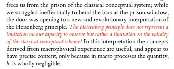
(ETBB font with OrangeRed  (#FF4500) italics )

In some cases boldface colour also gives very good results:

Either the well was very deep, or she fell very slowly, for she had plenty of time as she went down to look about her, and to wonder what was going to happen next.


Further reading:

Elements of Typographic Style by Robert Bringhurst

Forever Free Fonts

There are fonts and there are fonts. One of my earliest recollections of cognising that there are different “fonts” is from a typewritten letter I saw in my childhood (perhaps in the early-mid 90s). Though I didn’t know the term “font” then. Now I had seen typewritten materials earlier, as our exam papers were typewritten. But this said letter was somehow “different”. I didn’t know exactly what was different, but that letter and the typewritten text felt so elegant and aesthetic (again these words I didn’t know then, but trying to reconstruct my feelings from that time) as compared to the other typewritten documents that I had seen. The fact that I still remember that letter implies that it must have had some impact on my mind at that time. After that the printed “text” was never the same. I always tried to “see” the shapes of the text that I would read. Hence I “discovered” that the “fonts” in my school textbooks, and other books are different. I also discovered sans and serif in this way, but didn’t know the terms for them till a few years later. Thus began the journey to look at fonts keenly. Even with my handwriting, I developed 3-4 different scripts. None were cursive. I would play with the slant, then height of the letters, and my fountain pens did play the capable tools. With the computers came in plethora of fonts, more than you could count and keep track of. In the various image editing programmes the fonts achieve prime importance. A good font can make or break a document. It can render something mundane or render it to aesthetic appeal.
A good scientific question to think about is how does our cognitive system recognise that it is the same letter even if it is written in different fonts? Everyone’s handwriting is different even then (if they are legible) we can read and understand what they have written. This would imply that our cognitive system for recognising font faces as particular characters of language must be very very flexible. Any rigidity and we would not communicate. Douglas Hofstadter considers this very question in one of his essays Variations on a Theme as the Crux of Creativity in the Metamagical Themas (an anagram of “Mathematical Games”  by Martin Gardner whose columns Hofstadter replaced) column in Scientific American. The compilation of the columns was later published as a book in 1985.

FIGURE 12-3. 56 As in different styles, all drawn from a recent Letraset catalogue. The names of their respective typefaces are given on the facing page. To native readers of the Latin alphabet, it is an almost immediate visual experience to recognize how any one of them is an ‘A’. No conscious processing is required. A couple of these seem far-fetched, but the rest are quite obvious. The most canonical of all 56 is probably Univers (D-3). Note that no single feature, such as having a pointed top or a horizontal crossbar (or even a crossbar at all!) is reliable. Even being open at the bottom is unreliable. What is going on here? p. 243

Hence we have more and more fonts. Some very legible and some not so much.
Though I never somehow liked Times New Roman or Arial, which arguably might be the most popular fonts in documents (how do you find out the most used font?). Might be because they are default fonts on MS Word. One of my earliest, serious documents that I had to prepare on the computer was the project report of my bachelors programme. I did use MS Word, but the font used was Bookman Old Style. And the document did look different than the rest.

I did have a lot of fonts at that point. I installed all fonts that I could get my hands on. Remember this is early 2000, finding free resources on the internet was not easy, and downloading and getting them to your computer was even a bigger an issue (particularly large files). I owe to Viktor Juliet Papa most of my computer knowledge. Because of his mentoring I could muster guts to take out my HDD to cafe where he was the manager, to get downloaded stuff back. (Again only, portable data transfer devices were 3.5 inch floppy drives with 1.44 MB memory. Good luck with transferring 100s of MBs!, my main disk was 8G for reference) So much to risk, but no risk no gain.
Then in that summer during my internship at the University, I discovered LaTeX. And Computer Modern. It looked sooo elegant compared to TNR or Arial. And it had all the mathematical symbols too. At that point, you had to edit the tex file separately, and then compile it via terminal. It would produce a dvi file, which you would convert to postscript via dvi2ps, and then to pdf via ps2pdf. But it was all worth it! The output was divine compared to plebian MS Word. They say LaTeX doesn’t work well for people who have sold their souls! So my report for masters just two years later was in LaTeX. And I never switched back for most serious documents.

In the earliest days, there were very limited fonts in LaTeX. But with packages like XeLaTeX and LuaLaTeX you can use any system fonts in your documents, including non-Roman scripts also. Now there are native packages also which have a variety of fonts. So in my PhD I used Linux Libertine as the main font and associated Linux Biolinum as the Sans font. Wikipedia logo uses Linux Libertine.
 

Now with libertinus package you can use it with pdfLaTeX, no need to use XeLaTeX/LuaLaTeX (though some might find this step regressive). The font  comes with full math support, so that you can write the documents seamlessly.

 
Another nice set of fonts with full math support are kpfonts. Though I do not personally like the default sans that is bundled with it.

And one of the more elegant math fonts is urw-garamond, garamondx with mathdesign. Though this set has licensing restrictions that you may not like.

A sans math variant, that I have used occasionally is the GFS Neohellenic from the Greek Font Society.

These days for most of my Office documents (including google docs) I use EB Garamond for serif. It is too good.

And Quattracento Sans. For monofonts, particularly to be used in text editors (Emacs, I still use Linux Biolinum

in TeXShop I use Average Mono.

Some of the other sans fonts that I do use often are
GeoSans Light, Comfortaa and Josefin Sans.
For fixed width fonts, Latin Modern and Inconsolata, TeX Gyre Cursor are used. See the programming fonts in the list below

 
For handwriting effect there are several nice fonts that I have used. The best ones are Purisa, Comili

Amatic SC is a very elegant font for titles

New fonts will be continually developed. And for me fonts being free  (as in freedom) is the most significant aspect. Given this there is a large number of fonts which have been released under GPL, OFL and similar open licenses. Fonts released GPL license come with the font exception. Below is a partial list of free (as in freedom) fonts which you can browse to get the font for your needs (though some might have non-free content). The listing is alphabetical
Arkandis Digital Foundry  Not updated since 2015, but has nice fonts

Font Library (a largish list of Free Fonts with various licenses)

Google Fonts  Several nice fonts, in different scripts too.

LaTeX Font Catalog contains OTF and TTF files as well, my go to site for choosing LaTeX fonts


Lesser Known Programming Fonts
Programming Fonts (check individual licenses)
Let me know any other links to font databases which have free (as in freedom) fonts.
Happy typesetting!

Positive and Negative thin spaces in LaTeX

At times in LaTeX you want to introduce a small space between words. This is especially important in mathematical typesetting. Just adding a little bit of space hairspace, can alter the aesthetic look of the equation or mathematical entity substantially. For example consider this expression:

$|a|^{2}$

This produces the following
Screenshot 2020-04-04 at 15.47.51
The | braces are too close to the character “a”. To create a better version of this we introduce a small hairspace between the two. The code for hairspace is \,.
$|\,a\,|^{2}$
This produces a much nicer looking expression.
Screenshot 2020-04-04 at 15.47.55
This feature of hairspace was known to me for some time. But the problem came when I had to create a negative space. Take for example this expression:
 $F_{eff} = kx$
The result of this is not so nice looking as you can see:
Screenshot 2020-04-04 at 16.06.38
But then I came to know about a negative hairspace. The code for it is \!. Now let us introduce this in the above expression
$F_{e\!f\!\!f} = kx$
The result is much better visually:
Screenshot 2020-04-04 at 16.10.33