When I was writing my PhD thesis, as with anyone else it involved multiple drafts going back and forth. As far I am concerned writing is never a linear process. At times one cannot even write a single line in a day, and at other times you may finish a couple of sections in a few hours. Writing is difficult as it involves third level thinking (Dix 2006). You may have several ideas with you, you can also explicate while talking to others. But when it comes to writing it down we find it is not easy. But when we are in the “zone” the writing task becomes a natural thing. Your creative juices flow, the elusive ideas seem to express themselves in words. I usually experience such zone when l am at the end of the world task. The disparate looking ideas are bound together in a coherent whole. The feeling is close to an epiphany of a strange kind. You lose track of time and experience oneness with your work, as of the concrete form of ideas is a physical extension of your self. The feeling can be deeply satisfying to see your ideas on a concrete form. Mihaly Csikszentmihalyi uses the term “flow” to describe such an experience.
I experience the similar thing while reading a book. There are times when even reading a couple of sentences feels like a chore. While at other times when I am in the flow a hundred pages are finished in a couple of hours. The result seems effortless. Words just seen to read themselves or to you. Of course it also depends on the kind of book one is reading. Technical books will mostly take longer to read to read than lets say a science fiction novel.
When you are reading easily, you actually don’t read the entire words, letter by letter. Rather there is some sort of guess work or pre-processing that happens. Typically by looking at the starting letter and the end letter and also estimating the size of the word, we can actually guess the word before we can read it correctly. That is our cognitive system can fill in the gaps when we are dealing with familiar information. This makes the reading fast for experienced learners. A full use is made is of the repertoire of words that we know, and also rules of grammar. We expect certain words to follow certain words. And at times our system will fill in the gaps by itself when it finds some. This way the reading becomes effortless and we can make name out of it easily. Such fast refund comes with experience and knowing the language. When your children have difficulty in reading they have both problems. Their prediction system is not strong so they have to read each word and each letter in the word individually and only then they are angle to make sense. This then boils to be able to recognise the symbols as quickly as possible.
But how do we recognise the symbols that we see? There are several theories that attempt to explain our recognition of the symbols. The template theory posits that there are as many templates in our long term memory as many symbols we can detect. But this assumption of the theory puts severe demand on the long term memory and also on the processes which would the pattern recognition. A simple example which puts the template theory into spot is that we can recognise a letter in its various forms. The sheer number of fonts and handwriting, some of it bordering on illegible, we can recognise with little efforts lots severe strain on the template theory. The fact that we can also recognise the shape of fonts we have never seen before also poses a challenge.
The feature theory on the other hand posits that the long term memory has a set of features of the symbols which are essential in the symbol. For example, to recognise letter “w”, the feature set might include two lines slanting to the left and two lines slanting to right such as \/\/. This as soon as our sensory register gets this input of such lines we immediately pre process such input to a “w”. The feature theory posits three steps in pattern recognition which are collectively called as Analysis-by-Synthesis. In this process the pattern is broken down into its features, then these features are matched with Long Term Memory (LTM) and finally a decision about the pattern is taken. Thus with this theory we require much less number of items in our long term memory. The analysis-by-synthesis is completely driven by the data that impinges on the sensory organs.
Some of the challenges that this theory faces include ambiguity of how we deal with ambiguity in recognition of the patterns especially when the data is similar. In particular it does not answer our ability to consider importance of context in which the patterns appear and the sensory data itself is not good enough discriminator. In many cases turns out that we rely on other knowledge and information also to make sense of the patterns, in which case the feature theory alone cannot provide good explanations. For example, consider the Greek letter $\Delta$. Though we can identify it as such, the meaning it conveys can be heavily dependent on the context. We take three such examples.
- If it is seen in a sentence in Greek it will be interpreted as a sound “de” Το Δελχί είναι η πρωτεύουσα της Ινδίας (Delhi is India’s capital.).
- Now if the same letter $\Delta$ is seen in a mathematical context such as $\Delta ABC \cong \Delta PQR$, it represents a triangle and the sentence is read as “Triangle ABC is congruent to triangle PQR”.
- Finally, if the symbol $\Delta$ appears in a physics formula, lets say $\Delta E = E_{2} – E_{1}$, it represents a difference in the two values of $E$ and is read as “Delta E”.
Or consider the two sentences below
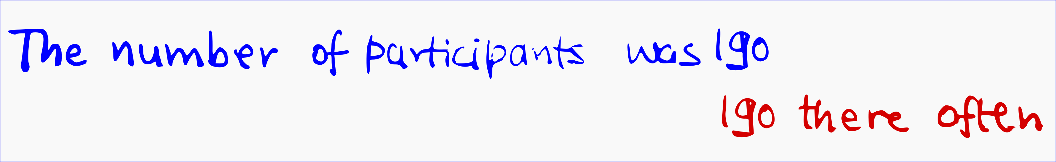
In the first sentence we will probably read it as “The number of participants was 190 (one hundred and ninety)” while in the second sentence we would read it as “I go there often”. Note here that the visual pattern is the same in both the sentences. Yet the context of the sentence makes all the difference in how we interpret the pattern. From such experiences we must conclude that context affects the pattern recognition by activating some conceptual information from LTM or pre-synthesising the pattern. Thus our cognitive system adds more information based on the contexts to the perceptual data to make sense of the patterns and context establishes what to expect in the incoming patterns.
Now this adaptive feature of the our cognitive system can be very useful and allows us to be much faster than just being dependent on the perceptual information. But at times it can be maladaptive also. This notion brings us back to the title of this post. As I completed my first draft of the thesis, and gave it for comments, I discovered to my extreme horror and embarrassment that it was full of elementary grammatical mistakes. In the flow of writing down my ideas, I chose to just go with them. Though I did review what I had written, I did not find any obvious faults in it. This is something that you might have also experienced. It is difficult to see “obvious” break in ideas or abrupt endings in your own writing, and this for me also included “trivial” grammar rules of punctuation and articles as such. But when you are proof-reading work of someone else both “obvious” and “trivial” errors are markedly visible. I can say this as I have copy-edited and proof-read several long and short works, where I did found out the very same errors in other works which I could not in my own work. Thankfully, in my thesis most of the issues were of “trivial” grammar and no “obvious” conceptual or fundamental issues were pointed. I then furiously began correcting the “trivial” grammar issues in my work.
Why is this so? Seen in the framework of analysis-by-synthesis model, we know what we have written or wanted to write and our pre-synthesising cognitive system fills in the obvious gaps and creates the required and expected patterns contextually where they are found missing. We tend to “skip” over our writing as we read it in a flow, with background and context of why the text was written and what it wants to say. All the “obvious” and “trivial” errors and gaps are ironed out with the additional contextual information that we have about our own work. So we have to be extra-careful while proof-reading our own work. When we are reading work written by someone else, all this background information is not available to us, hence pre-synthesising of patterns happens at a lower level. This leads us to find “obvious” and “trivial” errors and gaps much easily.
I found that though I can do a good job of proofreading other persons’ work on a computer (using the record changes/comments on a word processor), for proofreading my own work, I usually take a printout and work on it with a pen. The concrete form of my work perhaps helps me in minimizing the pre-synthesising that happens. I usually take red ink for proofreading, perhaps reminiscing about how teachers in schools grade assignments.
References
Chapter 2 Hunt, R. R., & Ellis, H. C. (1999). Fundamentals of cognitive psychology. McGraw-Hill.
A. Dix (2006). writing as third order experience . Interfaces, 68, pp. 19-20. Autumn 2006.