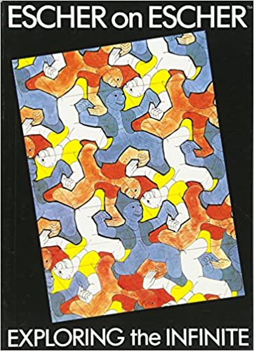
Recently (read some years back) I read Escher on Escher – Exploring the Infinite. This book gives an insight on how Escher viewed himself and his work. How were his social relations with his family, friends and admirers. Fame and appreciation of his work by a wide circle of people came late to Escher, when he was past his 50s. Escher was a perfectionist, he had almost perfected his craft of making woodcuts, taking it to its limits
as far as his hands and eyes could take. But that was the mere mechanical part of his work, the real part was the idea of the graphic print. The ideas it seems struggled a lot in his mind, making the print itself was the easier part. The ideas came to him, but later he strived for something entirely new, and succeeded.
On of the part of the book “Lectures That Were Never Given” has notes from the talks that Escher was supposed to give in the US of Amerika, but could not because of health reasons. Other include translations of his articles that appear in many of the art magazines and journals. These articles tell us how Escher looked at the work he was doing, and his feelings about other artists works. But he was the most critical about his own work.
This is what he had to say about the ancient cave-painters:
# 12
But his will and his capacity to produce pictorial images were at the least just as strong as ours. Perhaps even stronger because he was in direct contact with nature, which we usually approach by the way of a cultural and educational system that, if not barring the was, certainly obstructs it for us.
# 13
Illustrations are consequently for the graphic artists (mostly) an indispensable link in the chain of activities, but never his goal. That is probably the reason why a graphic artists cannot suppress a feeling of dissatisfaction when presented with an illustration as end result. You see, I don’t give reasons, only statements.
# 15
The above-mentioned elements of repetition and multiplication is /not/ in conflict with this. On the contrary, order is repetition of units; chaos is multiplicity without rhythm.
Escher also talks about the influence Bach’s music had on his work. He says after hearing Bach’s Goldberg variation in a concert (this is from the acceptance address for an award which he gave to city of Hilversum):
# 20
That was to Bach to whom I have pledged my heart and my intellect at the same time. Such beauty, of composition as well as of execution, cannot be possibly expressed in words.
Maybe same is also true of Escher’s own work. And the inspiration that he got from Bach was at a deep level, maybe if Bach was a contemporary, Escher wouldn’t have felt that lonely in his life. He says:
# 20
Bach’s music may perhaps provide the occasion to say a few words about my work. I had better not expound on the affinity I seem to have discovered between the canon in polyphonic music and the regular division of a plane into figures with identical forms, no matter how striking it is to me that the Baroque composers have performed manipulations with sounds similar to the ones I love to do with visual images.
Allow me to say only that Father Bach has been a strong inspiration to me, and that many a print reached definite form in my mind while I was listening to lucid, logical language he speaks, while I was drinking the clear wine he pours.
And this is what he has to say about his own work:
# 21
I can’t keep fooling around with our irrefutable uncertainties. It is, for example. a pleasure knowingly to mix up two- and three-dimensionalities, flat and spatial, and to make fun of gravity. Are you really sure that a floor can’t also be a ceiling? Are you definitely convinced that you will be on a higher plane when you walk up a staircase? Is it a fact as far as you are concerned that half an egg isn’t also half an empty shell?
Such apparently silly questions I pose first to myself (because I am my own first observer), and then to others who are kind enough to come and observe my work. It is satisfying to note that quite a few people enjoy this kind of playfulness, and that they aren’t afraid to modify their thinking about rock-solid realities.
And about art itself and the feelings that it manifests in us he says:
# 21
To tell you the truth, I find the concept of “art” a bit of dilemma. What one person calls “art” is often not “art” for another. “Beautiful” and “ugly” are old-fashioned concepts that are only rarely brought into the picture nowadays – maybe rightfully so, who is to say? Something repellant, something that gives you a moral hangover, something that hurts your eyes and ear can still be art!
And he says about himself:
# 21
So I am a graphic artist with heart and soul, but the rating “artist” makes me a feel a little embarrassed.
Next in the book are the “Lectures That Were Never Given”. These are the notes accompanying the slides, the text tells us about the technique and thought and thinking about the work. Escher has interesting way of putting thoughts about his work and the creatures it contains. He suggests to us that the creatures have ideas and behavior of their own.
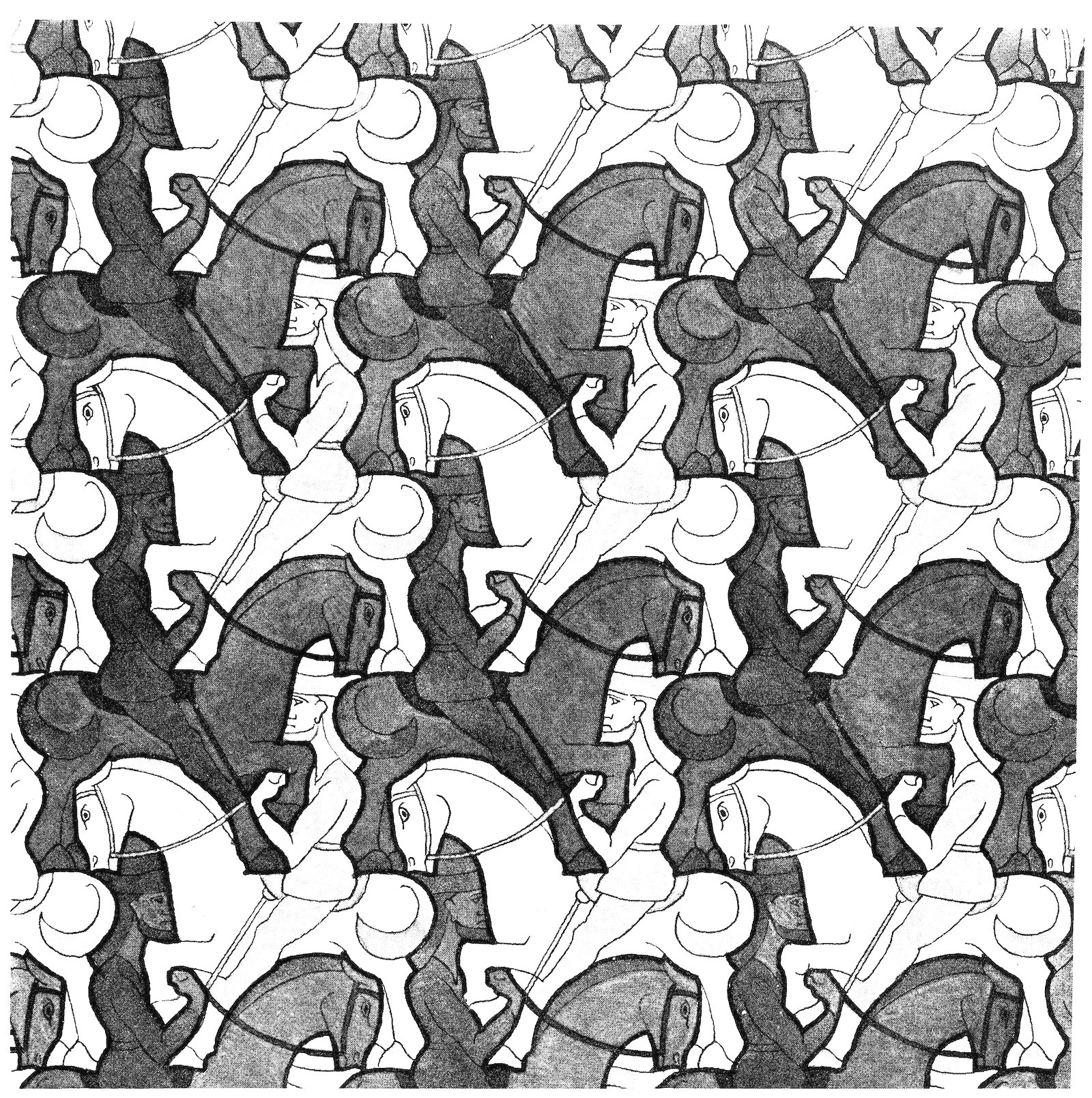
# 30
On Horsemen and Symmetry Work 67 (glide reflection) The left horsemen, as a creature, was exceptionally obliging and willing. It happens rarely that my subjects so meekly allow themselves to be portrayed in detail.
# 31
While drawing, I feel as if I were a spiritualistic medium, controlled by creatures that I am conjuring up, and it is as if they themselves decide on the shape in which they like to appear.
And the regular division of the plane is a theme which he calls “unusual mania” and its origins.
# 30
I often have wondered at this, for an artist, unusual mania of mine to design periodic drawings. Over the years I made about a hundred fifty of them. In the beginning, that was some forty years ago, I puzzled quite instinctively, apparently without any well-defined purpose. I was simply driven by the irresistible pleasure I felt in repeating the same figures on a piece of paper. I had not yet seen the tile decorations in Al-hambara and never heard of crystallography; so I did not even know that my game was based on rules that have been
scientifically investigated.
And on interpretations of his work, in which people find what they want, religious, spiritualistic and philosophical messages he says this:
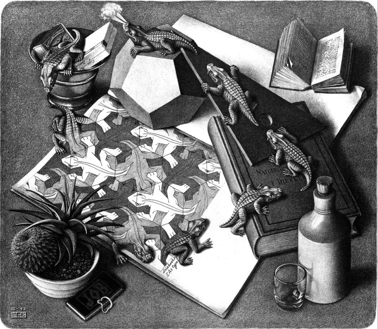
# 47 (Reptiles)
I never had any moralizing or symbolizing intention with this print, but some years later one of learned customers told me that it is a striking illustration of the doctrine of reincarnation. So it appears that one can even be symbolizing without knowing it.
And on the self-portraits that he has something to say to us regarding ourselves, ( involving a bit of narcissism, I think) :
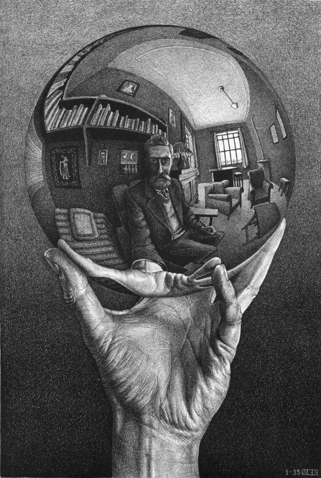
# 60 (Hand with Reflecting Sphere, Three Spheres II)
Your own head, or more exactly the point between your eyes, is the center. No matter how you turn or twist yourself, you can’t get out of that central point. You are immovably the focus of your world.
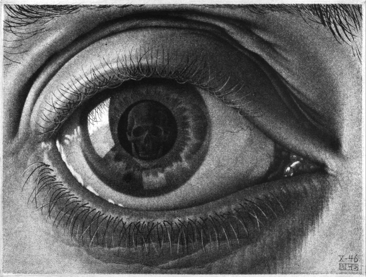
# 61 (Eye)
I choose the features of Good Man Bones, with whom we are all confronted whether we like it or not.
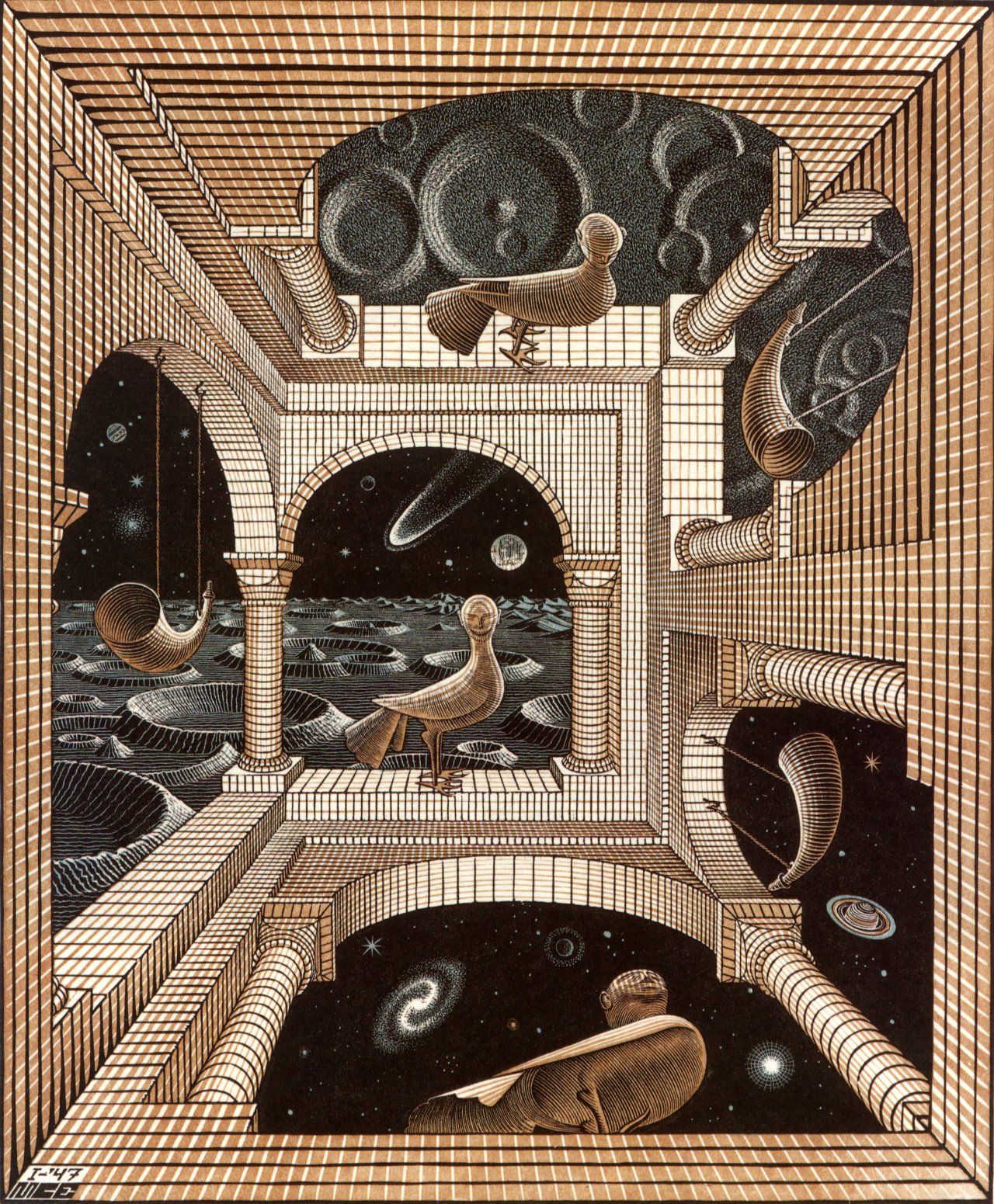
And on Print Gallery, (one of my personal favourites) he says:
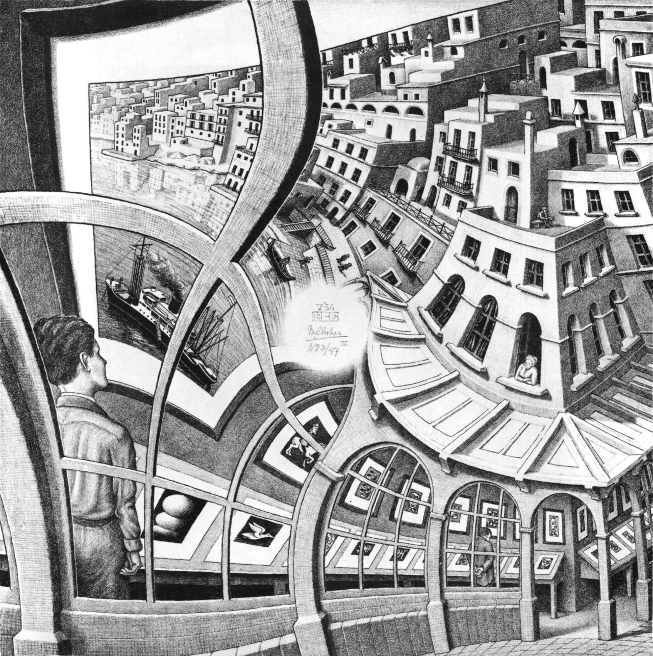
# 67 (Print Gallery)
Thus having let our eyes rove in a circular tour around the blank center, we come to the logical conclusion that the young man himself also must be part of print he is looking at. He actually sees himself as a detail of the picture; reality and image are one and the same.
This is something that I can relate to. The life we observe is ultimately the print and we are actually observing ourselves in life as in young man in the Print Gallery. And on perspectives and absurdities of logical opposites he says:
# 73 (Another World)
It may seem absurd to unite nadir, horizon and zenith in one construction, and yet if forms a logical whole.
In form and function the idea of logical opposites forms, much of the basis for Escher’s work. Visit to Al-hambara had a special significance for Escher. Here he found that the Moorish artists had explored the regular division of
the plane, but he lamented that they restricted themselves to abstract geometric forms and not to the anything that is present in nature which he himself felt an urge for.
# 83
After that first Spanish trip in 1922, I became more and more intrigued by the fitting together of congruent figures according to the above-mentioned definition and by the effort to shape this figures in such a way that they would evoke in the observer an association with an object or a living form of nature. (emphasis in original)
# 88
With regard to my present work, this proves to what extent I feel liberated from the graphic arts simply for the sake of graphic arts.
About the graphic artist with which he identified:
# 90
The graphic artist, however, is like a blackbird that sings in the treetop. Again and again he repeats the song, complete in every copy he makes. The more copies people ask him to make, the better he likes it. He hopes the wind will spread his leaves over the Earth, the farther the better – not like the dry leaves in autumn but like feather-light seeds capable of germinating.
And I think Escher has attained this goal which he describes above very well. His works have germinated into new ideas to a new era of graphic artists and others. And on the old techniques of graphic art:
# 90
Consequently, the emphasis falls unjustifiably on process, and one hardly takes into account the actual goal of all that drudgery. No matter how much joy the exercise of a noble craft can bestow, let us not forget that it is a means of repeating and multiplying. Repetition and multiplication – two simple words. The entire world perceivable with the senses will fall apart into meaningless chaos if we could not cling to these two concepts.
On him being called an “expert.”
# 92
A feeling of helplessness comes over me now that I am faced with describing what is meant by this designation. To my unending amazement, however, this is apparently so unusual and in a sense so new that I am unable to identify any “expert” in addition to myself who is sufficiently comfortable with it to give a written explanation.
# 93
By doing this they have opened the gate that gives access to a vast domain, but they themselves have not entered. Their nature is such that they are more interested in the way the gate is opened than in the garden that lies behind it. Sometimes I think I have covered the entire domain and trod all the paths and admired all the views. Then all of a sudden I find another new way, and I taste a new delight.
On his explorations of the plane and its drawings
Because what fascinates me, and what I experience as beauty, is apparently considered dull and dry by others. A plane which one must imagine as extending without boundaries in all directions, can be filled or divided into infinity, according to a limited number of systems, with similar geometric figures that are contiguous on all sides without leaving “empty spaces.”
We don’t to master everything required to construct something in order to appreaciate it.
# 94
Just as I do not consider it necessary to know all the tricks of the graphic trade in order to appreciate prints, neither do I believe that one must master in detail the theoretical fundaments of division of planes in order to learn to value this and to accept that it can exert an inspiring influence, as I have experienced.
On the unending nature of many of creations.
# 95
I see it as a means of representing timelessness, the dimensionlessness, that existed before life commenced and that will return when life again ceases.
On the dynamic nature of his drawings and comparison to film and reading of a book.
# 98
The series of static representations achieved a dynamic character due to the time span that was needed to follow the whole story. In contrast to this cinematographically projected images of a film which appear one in the after the other on an immovable place, onto which viewer’s eye remains directed without moving. In the case of both the medieval story in images and the developing pattern of a regular filling of a plane, the images are located next to each other, and timing becomes a factor in the movements made by viewer’s eye as it follows the story from image to image. In this way, holding a strip of film in hand, one observes it image by image, reading a book is also done more or less in the same manner.
# 99
Is it possible to make a representation of recognizable figures that has no background? To see only a “figure” is not conceivable because something that manifests itself as a figure, that is, as “thing to be seen,” is limited, whether it is real or not. A limitation also means a separation with regard to something else. That “something else” is the background from which the figure (or object sensation) frees itself.
# 100
Imagination and inventiveness, not to mention tenacity, are indispensable for this work. They come to us from “somewhere out there” but we can facilitate their path to us and encourage and
cultivate them in various ways. Among others I found one in writings of Leonardo da Vinchi. This is
the fragment, translated as best I can:
“When you have to represent an image, observe some walls that are besmeared with stains or composed of stones of varying substances. You can discover in them resemblances to a variety of mountainous landscapes, rivers, rocks, trees, vast plains and hills. You can also seen in them battles and human figures, strange facial features and items of clothing, and an infinite number of other things whose forms you can straighten out and improve. It is the same with crumbling walls as it is with the sound of church bells, in which you can discover every name and every word you want.”
Despite all this conscious and personal effort the illustrator still gets the feeling that some kind of magic action is taking place as he moves his lead pencil over the paper. It seems as if it isn’t he who determines the shapes but rather that the simple, flat stain is guiding or impeding the movements of the hand that draws, as if the illustrator were a spiritualistic medium. In fact, he is amazed, not to say taken aback, at what he sees appearing under his hand, and he experiences with regard to his creations a humble feeling of gratitude or of resignation depending on whether they behave willingly or reluctantly.