
Science education should move away from rote and memory based approach. Science in the schools should be done primarily with hands, and be supported by building conceptual structures based on this experience. Ideas of science need concrete experiential basis. But any such approach to change how science is taught and learnt in the schools will be unsuccessful if we do not change the assessments methods and techniques.
Assessment in education is a horcrux to improve the education. Unless you make changes in assessments types and methods, the large scale picture of education is not going to change. All the efforts towards “improving” education have largely failed precisely because of this. As Papert commented decades ago, the educational system acts like a living organism that wants to maintain status quo. Any change in the fundamental processes such as classroom discourse, or teacher professional development must be accompanied by equivalent changes in the assessment techniques. Failing that the reforms will hit a block and if successful, will be very limited than the original objective. This is why I say assessment is like a horcrux, change the assessment type and patterns, the other systemic changes will follow.
For example, the teachers have been for several decades now being fed (forced?) with the agenda of using constructivism as an approach in their classroom teaching. The teacher training curricula has chapters on this very idea, with Piaget and Vygotsky being the buzzwords. (Whether constructivism is the best approach to teaching and learning is another question to be pondered. The fact remains that most academics accept by default that constructivism is the only way forward for better education.) So after learning all these theories, when it comes to actual classroom, these theories don’t mean much particularly in later grades. Because none of our assessments, particularly in the all important, life-defining, board exams are not constructivist in nature. Conversely, they are exemplars of rote-memory based assessments, in which replicating from memory in a given time frame is the most crucial quality that a learner can possess. So where do all the constructivist approaches go in the case of board exams? Are these exams even oriented to handle the constructivism based learning approach? They are not, hence all such reforms are doomed to fail. I call such reforms in school education as cosmetic reforms as they only change the appearance (in a limited way, and for limited people) rather than changing the educational approaches.
cosmetic | kɒzˈmɛtɪk | adjective: affecting only the appearance of something rather than its substance:
At most such cosmetic reforms create employment opportunities for educational researchers like myself, who bask in glory of research outputs such reforms create. Most of such research do not lead to any changes to implementation, but remain insulated and experimental cases which may not be scalable. Here one such idea is presented, might be too theoretical or not be scalable but worth sharing with others.
3R approach to science education – Record, Research, Report
The 4Rs of education are crucial, this idea is specific to science education which can be applied to other forms of education as well. But here it is presented in the context of science education. The basic idea is on project based learning in which the learners record (collect the data), research (analyse the data) and report the data back to their peer group. The choosing of the projects has to be done carefully so that there are natural variations in the implementation by different learners. It definitely should not be cookbook type projects in which everyone gets the same answer. The research questions for the project are hence important and can be akin to renewable assessments of Wiley. At the end of it they must lead to creation of something of value and interest to the learner, peers and community at large. It might be challenging to design such assessments, but then we are trying to change the overall approach to science education, cosmetic changes won’t work!
Record: The data should be recorded providing details of how it was done, and if possible with access to raw data stored somewhere. Someone else might find that data useful. FAIR principles might of help to understand how’s and why’s of data sharing.
Research: Analyse the data in the light of research questions, also some exploratory data analysis could be done. This might be an individual or a group task. Also interesting would be to look at how the learners work with data sets that have been created by others by incorporating them in their own research questions. Tools for analysis can be varied, and will depend on the type of research questions that are asked. Statistical analysis is only one part of research.
Report: Science is a community based activity. Unless the data and findings from analysing it are shared with the peer community, it is not possible to call something science. The reporting might (should?) not be a research paper but should incrementally report the progress or any major Aha! moments. Such reporting will also help to create a history which the learner can see, and actually look at various aspects of learning. Reporting something might itself lead to learning about things, as writing is a higher form of cognitive activity. Reporting is also a form of error correcting mechanism, which might lead to deeper engagement with peers and the subject matter.
So a platform that is needed should suffice to cater to these three needs. And this is cyclical, with reporting leading to next questions, which need data to record -> research -> report -> record
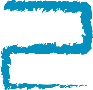
Keeping these in mind I have created a logo for RRR which inherently describes a cyclical process of these three components. A learner sits in the centre, with an eye on a telescope like “r” for recording.
Logo idea for Record, Research, Report


A versio without text.