John Tukey on data based pictures and graphs

John Tukey‘s wisdom on importance and value of graphics and pictures in making sense of exploring data.

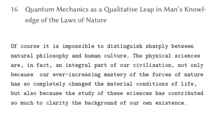
Consistent with this view, we believe, is a clear demand that pictures based on exploration of data should force their messages upon us. Pictures that emphasize what we already know — “security blankets” to reassure us — are frequently not worth the space they take. Pictures that have to be gone over with a reading glass to see the main point are wasteful of time and inadequate of effect. The greatest value of a picture is when it forces us to notice what we never expected to see. (p. vi emphasis in original)

John Tukey – Exploratory Data Analysis

Galileo’s Experiments on Accelerated Motion

A short account of Galileo’s description of his own experiment on accelerated motion — a short account of it, the apparatus he used and the results he got.
The first argument that Salviati proves is that in accelerated motion the change in velocity is in proportion to the time (𝑣 ∝ 𝑡) since the motion began, and not in proportion to the distance covered (𝑣 ∝ 𝑠) as is believed by Sargedo.

“But for one and the same body to fall eight feet and four feet in the same time is possible only in the case of instantaneous (discontinuous) motion; but observation shows us that the motion of a falling body occupies time, and less of it in covering a distance of four feet than of eight feet; therefore it is not true that its velocity increases in proportion to the space. (Salviati)

Also, he proves that the increase in proportion is not of simple doubling but larger. They agree upon a definition of uniformly accelerated motion,

“A motion is said to be equally or uniformly accelerated when, starting from rest, its momentum receives equal increments in equal times. (Sargedo)

To this definition Salviati adds an assumption about inclined planes, this assumption is that for a given body, the increase in speed while moving down the planes of difference inclinations is equal to the height of the plane. This also includes the case if the body is dropped vertically down, it will still gain the same speed at end of the fall as it would gain from rolling on the incline This assumption makes the final speed independent on the profile of the incline. For example, in the figure below, the body falling along𝐶 → 𝐵, 𝐶 → 𝐷 and 𝐶 → 𝐴 will attain the same final speed.

This result is also proved via a thought experiment (though it might be feasible to do this experiment) for a pendulum. The pendulum rises to the height it was released from and not more.
After stating this theorem, Galileo then suggests the experimental verification of the theorem. of The actual apparatus that Galileo uses is an wooden inclined slope of following dimensions: length 12 cubits (≈ 5.5 m, 1 cubit ≈ 45.7 cm), width half-cubit and three-finger breadths thick . In this plank of wood, he creates a very smooth groove which is about a finger thick. (What was the thickness of Galileo’s fingers?) The incline of this plank are changed by lifting one end. A bronze ball is rolled in this groove and time taken for descent is noted.

“We repeated this experiment more than once in order to measure the time with an accuracy such that the deviation between two observations never exceeded one- tenth of a pulse-beat.

Then Galileo performed variations in the experiment by letting the ball go different lengths (not full) of the incline and “found that the spaces traversed were to each other as the squares of the times, and this was true for all inclinations of the plane”. Each variation was repeated hundreds of times so as to rule out any errors. Also, the fact that for different inclines the times of descent were in noted and were in agreement with the predictions.
Since there were no second resolution clocks to measure time, Galileo devised a method to measure time using water. This was not new, water clocks were used earlier also.

The basic idea was to the measure the amount of water that was collected from the start of the motion to its end. The water thus collected was weighed on a good balance.This weight of water was used as a measure of the time. A sort of calibration without actually measuring the quantity itself: “the differences and ratios of these weights gave us the differences and ratios of the times”

Galileo used a long incline, so that he could measure the time of descent with device he had. If a shorted incline was used, it would have been difficult to measure the shorter interval of time with the resolution he had. Measuring the free fall directly was next to impossible with the technology he had. Thus the extrapolation to the free fall was made continuing the pattern that was observed for the “diluted” gravity.

“You present these recondite matters with too much evidence and ease; this great facility makes them less appreciated than they would be had they been presented in a more abstruse manner. For, in my opinion, people esteem more lightly that knowledge which they acquire with so little labor than that acquired through long and obscure discussion. (Sargedo)


Reference

Dialogues Concerning Two New Sciences

Puneral

Pun is a play on words. Sometimes pun is fun. Sometimes it is risqué. Some times it has dirty meaning.  It is considered to be a sign of wit. A mastery of puns is admirable. Is the person who makes a pun called a punner? And sin of making bad puns called punnery?  It makes meaning not literal. It adds a layer of meaning to the words, which goes beyond the literal meaning. But why would anyone want that? If the author wants to convey some other meaning why not write that but go about it in a circuitous way? Not everyone can make sense of puns. Perhaps some puns are too clever for anyone to understand! Maybe all sentences are pun but they are beyond our cognitive capacities to understand them. Sometimes the pun goes unnoticed or sometimes it is feared that one might be construed when there is none.  Then people say “Pun intended”  or “Pun unintended?!” Intending a pun is easy but how does one not intend a pun? At what cognitive stage do humans start to understand and appreciate puns? Are puns present in all languages? But nonetheless there are bad puns and good puns and then there are dead puns. 
When puns are killed, the resultant ceremony in its memory is a puneral. So a puneral is a funeral for puns. Sometimes puns are so bad that it is like murdering them in broad daylight. What are some examples? But is daylight always broad? I should say narrow night light? Or in medium twilight? Is light always needed for murder? How about a no light murder? Would it be heavy then?

News about murdering raisins is in the current affairs section of the paper.

Is this a bad pun? Does it qualify for a puneral?
But anyways. Puneral is the word to describe that event which is the procession for mourning the abuse of puns. It is just me coining new terms with some meaning and/or just writing some nonsense. Earlier I had coined cigol. Go fetch the meaning.

A Puneral Procession? – Owl and Pussycat by Edward Lear

But how would such a procession would look like? Can we at all visualise a puneral? Or it is an abstracted out event coming from nowhere and going to nowhere? Of no fixed address they say. But does a pun have an address? Is a pun always addressed to someone? Can a pun be self-reliant and self-referential? What if a pun commits a suicide? Or it commits a harakiri because it is ashamed at the sheer cheesiness of itself? What do grammar nazis feel about punerals? What about astute english professors? Sorry didn’t Capitalise the “E” in english? Was it intentional non-capitalisation? Does everything have intent? Is every stance intentional? Or is there random blabbering? (some might say just like this post! Is this a self referential sentence?) What can be other meanings of puneral? PUNE Roadways And Logistics? Keep guessing. Or is it PUNE feRAL for feral things in Pune?
Well, who knows about such things?
 

Making the first letter decorative, large and capital in a text using LaTeX

In many of the old books we have the first letter as a large decorative capital. Many times very ornamental typefaces are used. Some examples

Petri Apiani Cosmographia, 1539

Johannes Hevelius Selenographia 1647

Johannes Hevelius  Machina celestis

1882

A Letter from Hevelius on observations of a comet, 1683

Sphaera c. 1230 by Sacro Bosco (Ed. published by Peter Apianus, 1526)

FROM GALILEO TO NUCLEAR AGE LEMON 1949

example of drop caps from old books

VISUAL ILLUSIONS LUCKIESH 1922

Another style that is often employed with the large capital letter is that the rest of the word, or the sentence is in small caps. Now small caps are distinct than the regular caps. They are capitals, but with the x-height of small letters. And small caps usually have slightly larger spacing between the words than the regular one.

RELATIVITY AND ITS ROOTS HOFFMAN 1983

The Night Thoughts of a Classical Physicist McCormmach 1982

The Pleasure of Text Barthes 1975

Now, even in some of the modern books the same effect is used. So if you are looking for a way to achieve this effect using LaTex, then lettrine is the package you are looking for.

Drop caps

The name of this effect is drop caps. When I was searching for finding a solution for achieving this effect, the first block was that I didn’t know what it was called! After a bit of searching here and there I finally came to know about the name: drop caps. So if you are stuck as I was about what this large capital letter style is called, thence the descriptive and verbose title of post.
Now back to LaTeX implementation. lettering gives you several options for customising the drop caps. For the simplest case, we can use the default font of the document
\usepackage{lettrine}
 
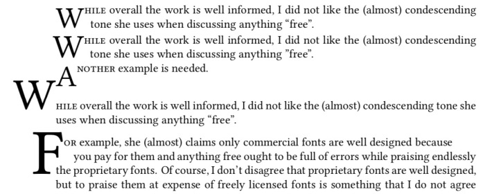
\lettrine{W}{hile} overall the work is well informed, I did not like the (almost) condescending tone she uses when discussing anything “free”. 
\lettrine[lines=2,lhang=.1,loversize=0.1]{W}{hile} overall the work is well informed, I did not like the (almost) condescending tone she uses when discussing anything “free”. 
\lettrine{A}{nother} example is needed.
\lettrine[lines=1,lhang=1,loversize=0.5]{W}{hile} overall the work is well informed, I did not like the (almost) condescending tone she uses when discussing anything “free”. 
  \lettrine[lines=3,lhang=0.75,loversize=0.25]{F}{or} example, she (almost) claims only commercial fonts are well designed because
These examples produce the following output


Now we can also use fancy header fonts. Have a look at some of them here.

\newfontfamily\zallman[Scale=4]{ZallmanCaps}
\renewcommand*{\LettrineFont}{\zallman}


\newfontfamily\acorn[Scale=4.2]{AcornInitials}
\renewcommand*{\LettrineFont}{\acorn}

You will need to play with the parameters for different fonts to find a better fit for your document.
Now how to add colour?
\lettrine[lines=3]{\color{red}S}{tart} 
\vspace{30pt}
\lettrine{\color{green}W}{hile} overall the work is well informed, I did not like the (almost) condescending tone she uses when discussing anything “free”. 
\lettrine[lines=2,lhang=.1,loversize=0.1]{\color{blue}W}{hile} overall the work is well informed, I did not like the (almost) condescending tone she uses when discussing anything “free”.

Happy typesetting!

A complex systems approach to biology – a review of How Leopard Changed its Spots by Brian Goodwin

How the Leopard Changed it Spots by Brian Goodwin talks about a different approach to biology. After the genetic and molecular biology revolution 1950s onwards, increasingly the organism has been shifted out of focus in biology. Instead genes and their effect, genocentrism or neo-Darwninism, have taken the central stage. Everything in biology is seen as an “action” of genes in addition to natural selection. This translates to reductionism, everything is reduced to genes which are considered as the most fundamental units of life. This is the dominant approach in biology for some decades now. The terms such as “selfish gene” basically highlight this point. Such an approach sidelines the organism as a whole and its environment and highlights the genes alone. Good draws analogy of “word” of god seen as the final one in scriptures to the code alphabet in the genes, as if their actions and results are inevitable and immutable.
Goodwin in his work argues against such an approach using a complex systems perspective. In the process he also critiques what is an acceptable “explanation” in biology vis-a-vis other sciences. The explanation in biology typically is a historical one, in which features and processes are seen in the light of its inheritance and survival value of its properties. This “explanation” does not explain why certain forms are possible. Goodwin with examples establishes how action of genes alone cannot establish the form of the organism (morphogenesis). Genes only play one of the parts in morphogenesis, but are not solely responsible for it (which is how neo-Darwinist account argue). He cites examples from complex systems such as Belousov–Zhabotinsky reaction, ant colonies to establish the fact that in any system there are different levels of organisation. And there are phenomena, emergent phenomena, which cannot be predicted on the basis of the properties constituent parts alone. Simple interactions of components at lower level can give rise to (often) surprising properties at higher level. He is very clear that natural selection is universal (Darwin’s Dangerous Idea?!)

> What this makes clear is that there is nothing particularly biological about natural selection: it is simply a term used by biologists to describe the way in which one form replaces another as a result of their different dynamic properties. This is just a way of talking about dynamic stability, a concept used for a long time in physics and chemistry. We could, if we wished, simply replace the term natural selection with dynamic stabilization, the emergence of the stable states in a dynamic system. p. 53

Goodwin uses the term morphogenetic space to convey the possible shape space that an organism can occupy. Thus seen from a complex systems perspective, the various unit of the organism interact to generate the form of the organism. Natural selection then acts as a coarse sieve on these forms with respect to the environmental landscape. The “aim” of the organism is not the climb the fitness lanscape but to achieve dynamic stability.

> The relevant notion for the analysis of evolving systems is dynamic stability: A necessary (though by no means sufficient} condition for the survival of a species is that its life cycle be dynamically stable in a particular environment. This stability refers to the dynamics of the whole cycle, involving the whole organism as an integrated system that is itself integrated into a greater system, which is its habitat. p. 179

Goodwin takes examples of biological model systems and shows how using mathematical models we can generate their forms. Structure of acetabularia (a largish ~1 inch single cell algae), the structure of eye, the Fibonacci pattern seen in many flower structures being the main examples. Also, how the three basic forms of leaf arrangement can be generated by variations on a theme in the morphospace are discussed in detail. The model shows that three major forms are the most probable ones, which is actually substantiated by observations in nature. In these examples, an holistic approach is taken in which genes, competition and natural selection only play a part are not the main characters but are interacting and cooperating with levels of organisation of the organism, environmental factors in the drama of life.

> Competition has no special status in biological dynamics, where what is important is the pattern of relationships and interactions that exist and how they contribute to the behavior of the system as an integrated whole.The problem of origins requires an understanding of how new levels of order emerge from complex patterns of interaction and what the properties of these emergent structures are in terms of their robustness to perturbation and their capacity for self-maintenance. Then all levels of order and organization are recognized as equally important in understanding the behavior of living systems, and the reductionist insistence on some basic material level of cause and explanation, such as molecules and genes, can be recognized as an unfortunate fashion or prejudice that is actually bad science. P.181

Since I am already a believer of the complex systems perspective, I was aware of some of the arguments in this book, but the particular worked examples and their interpretation for biology was a fresh experience.


On the new “Block Editor” of WordPress

In your life there are some irritating characters. People who irritate you to no end. Maybe its their behavior, body language, or way they speak or dress. They just infuriate you and you cannot tolerate their presence. In case you cannot ask them to effoff, you just get the interaction with them over as soon as possible. Yet they persist.
Similarly, there are software applications which fit in this role of irritating characters. They bug you to do things which it (meaning the software designers) think is the “correct” way. One such crappy piece of software is the new “block editor” of wordpress. It is an application which irritates and interferes in the very process of writing a blog. Maybe there are people who like it, (to each their own). But I personally think the block editor is a cook book of how not to design software. Or Maybe I am too old to make new chic editors work well for me.
Every time it bugs you. Like a cheap salesman trying to sell his shitty wares to you. I am not sure why I can’t use the “classic editor” if I am more comfortable with it. Why is wordpress hell bent shoving this un-user friendly piece of software down to everyone’s posts? The block editor may have its advantages, but not for me.  I prefer simple editor which allows me to focus on the writing instead of a menu popping every now and then which I have to click to dismiss. If I want a block I will call it, I don’t want the editor to push a block between me and my post. Block editor is defective by design in a way.
And there is no way you can turn it off unless you pay. WordPress perhaps knows this, that their editor is trash. Hence only with a hefty upgrade of “business” plan you can get it off your back by installing a “plugin” for classic editor, which should be there by default in the first place. This is akin to ransomware. You pay us or you continue to have shitty, sub-optimal experience with irritating pop-ups. Mind you I am not talking about completely free wordpress installation, it doesn’t even come with “personal” or “premium” plans so even with paid service they don’t want you to have any control over what editor you use.
So my workflow is now, to create a new post in “block editor”, then save a draft, return to the “All posts” and then continue with classic editor. Even then it continuously bugs you if I want to edit in the block editor, if I wanted to I would have, Now since I don’t want, can you please effoff and store this simple request of using classic editor next time?

No it won’t. Aren’t software designers at wordpress capable of understanding this simple request? Or they are doing it willingly to force people to move to their way however irritating and uncomfortable they are?
If wordpress even removes this support for classic editor, I will surely leave this platform and take my blog somewhere else. I was contemplating to leave it this year, but my lethargy prevented me from doing it. But then, lethargy has its limits and and so has patience in dealing with (purposefully) badly designed software applications and processes.


Forever Free Fonts

There are fonts and there are fonts. One of my earliest recollections of cognising that there are different “fonts” is from a typewritten letter I saw in my childhood (perhaps in the early-mid 90s). Though I didn’t know the term “font” then. Now I had seen typewritten materials earlier, as our exam papers were typewritten. But this said letter was somehow “different”. I didn’t know exactly what was different, but that letter and the typewritten text felt so elegant and aesthetic (again these words I didn’t know then, but trying to reconstruct my feelings from that time) as compared to the other typewritten documents that I had seen. The fact that I still remember that letter implies that it must have had some impact on my mind at that time. After that the printed “text” was never the same. I always tried to “see” the shapes of the text that I would read. Hence I “discovered” that the “fonts” in my school textbooks, and other books are different. I also discovered sans and serif in this way, but didn’t know the terms for them till a few years later. Thus began the journey to look at fonts keenly. Even with my handwriting, I developed 3-4 different scripts. None were cursive. I would play with the slant, then height of the letters, and my fountain pens did play the capable tools. With the computers came in plethora of fonts, more than you could count and keep track of. In the various image editing programmes the fonts achieve prime importance. A good font can make or break a document. It can render something mundane or render it to aesthetic appeal.
A good scientific question to think about is how does our cognitive system recognise that it is the same letter even if it is written in different fonts? Everyone’s handwriting is different even then (if they are legible) we can read and understand what they have written. This would imply that our cognitive system for recognising font faces as particular characters of language must be very very flexible. Any rigidity and we would not communicate. Douglas Hofstadter considers this very question in one of his essays Variations on a Theme as the Crux of Creativity in the Metamagical Themas (an anagram of “Mathematical Games”  by Martin Gardner whose columns Hofstadter replaced) column in Scientific American. The compilation of the columns was later published as a book in 1985.

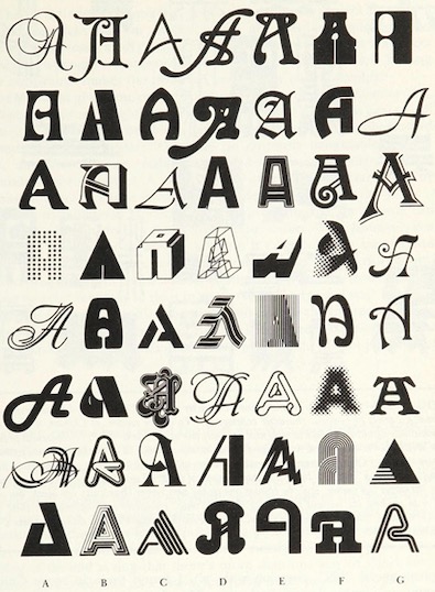
FIGURE 12-3. 56 As in different styles, all drawn from a recent Letraset catalogue. The names of their respective typefaces are given on the facing page. To native readers of the Latin alphabet, it is an almost immediate visual experience to recognize how any one of them is an ‘A’. No conscious processing is required. A couple of these seem far-fetched, but the rest are quite obvious. The most canonical of all 56 is probably Univers (D-3). Note that no single feature, such as having a pointed top or a horizontal crossbar (or even a crossbar at all!) is reliable. Even being open at the bottom is unreliable. What is going on here? p. 243

Hence we have more and more fonts. Some very legible and some not so much.
Though I never somehow liked Times New Roman or Arial, which arguably might be the most popular fonts in documents (how do you find out the most used font?). Might be because they are default fonts on MS Word. One of my earliest, serious documents that I had to prepare on the computer was the project report of my bachelors programme. I did use MS Word, but the font used was Bookman Old Style. And the document did look different than the rest.

I did have a lot of fonts at that point. I installed all fonts that I could get my hands on. Remember this is early 2000, finding free resources on the internet was not easy, and downloading and getting them to your computer was even a bigger an issue (particularly large files). I owe to Viktor Juliet Papa most of my computer knowledge. Because of his mentoring I could muster guts to take out my HDD to cafe where he was the manager, to get downloaded stuff back. (Again only, portable data transfer devices were 3.5 inch floppy drives with 1.44 MB memory. Good luck with transferring 100s of MBs!, my main disk was 8G for reference) So much to risk, but no risk no gain.
Then in that summer during my internship at the University, I discovered LaTeX. And Computer Modern. It looked sooo elegant compared to TNR or Arial. And it had all the mathematical symbols too. At that point, you had to edit the tex file separately, and then compile it via terminal. It would produce a dvi file, which you would convert to postscript via dvi2ps, and then to pdf via ps2pdf. But it was all worth it! The output was divine compared to plebian MS Word. They say LaTeX doesn’t work well for people who have sold their souls! So my report for masters just two years later was in LaTeX. And I never switched back for most serious documents.

In the earliest days, there were very limited fonts in LaTeX. But with packages like XeLaTeX and LuaLaTeX you can use any system fonts in your documents, including non-Roman scripts also. Now there are native packages also which have a variety of fonts. So in my PhD I used Linux Libertine as the main font and associated Linux Biolinum as the Sans font. Wikipedia logo uses Linux Libertine.
 

Now with libertinus package you can use it with pdfLaTeX, no need to use XeLaTeX/LuaLaTeX (though some might find this step regressive). The font  comes with full math support, so that you can write the documents seamlessly.

 
Another nice set of fonts with full math support are kpfonts. Though I do not personally like the default sans that is bundled with it.

And one of the more elegant math fonts is urw-garamond, garamondx with mathdesign. Though this set has licensing restrictions that you may not like.

A sans math variant, that I have used occasionally is the GFS Neohellenic from the Greek Font Society.

These days for most of my Office documents (including google docs) I use EB Garamond for serif. It is too good.

And Quattracento Sans. For monofonts, particularly to be used in text editors (Emacs, I still use Linux Biolinum

in TeXShop I use Average Mono.

Some of the other sans fonts that I do use often are
GeoSans Light, Comfortaa and Josefin Sans.
For fixed width fonts, Latin Modern and Inconsolata, TeX Gyre Cursor are used. See the programming fonts in the list below

 
For handwriting effect there are several nice fonts that I have used. The best ones are Purisa, Comili

Amatic SC is a very elegant font for titles

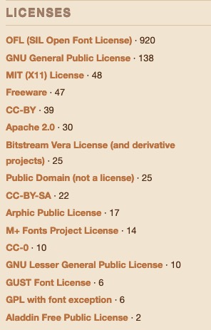
New fonts will be continually developed. And for me fonts being free  (as in freedom) is the most significant aspect. Given this there is a large number of fonts which have been released under GPL, OFL and similar open licenses. Fonts released GPL license come with the font exception. Below is a partial list of free (as in freedom) fonts which you can browse to get the font for your needs (though some might have non-free content). The listing is alphabetical
Arkandis Digital Foundry  Not updated since 2015, but has nice fonts

Font Library (a largish list of Free Fonts with various licenses)

Google Fonts  Several nice fonts, in different scripts too.

LaTeX Font Catalog contains OTF and TTF files as well, my go to site for choosing LaTeX fonts


Lesser Known Programming Fonts
Programming Fonts (check individual licenses)
Let me know any other links to font databases which have free (as in freedom) fonts.
Happy typesetting!

Color and underline text in LaTeX

For a particular project, I had a requirement that the text be coloured as well as underlined. Now making text underlined in LaTeX has a default support in the form of \underline{text}, which simply produces an underlined text.

But what if you want to customise the underlining, for example, change the thickness of the underline, or its distance from the text baseline. Or simply you might want to have a different colour for the underline. There are several packages which allow you to customise this exact requirement.

For the present post I will choose the soul package which has some other goodies for typesetting as well. You can load the package with \usepackage{soul} Along with underlining, you have have strikeout and highlight. To setup the underline, soul package gives three options, underline depth, underline thickness and underline colour (page 12-13 of the package documentation).

You can set this in the preamble

\setul{⟨underline depth⟩}{⟨underline thickness⟩}

It is recommended that the units of these lengths are in ex, so that they are relative to the font size. For example,

\setul{0.3ex}{0.1ex}

To use it in the document \ul{underlined text} will produce

Another option is to set the colour of the underline. This can be done with

\setulcolor{gray}

With this option, the above code will look like

The color option can be changed anywhere in the document, so you can have change of colours as required. Defining in the preamble has a universal effect.

So far so good. Now in this case I wanted the underlined text to be of different colour. For this one can define a newcommand with text colour option.

\newcommand{\ublue}[1]{{\color{SteelBlue}\ul{#1}}}

I am also using the svgnames option from the xcolor package for calling colours by names.

\usepackage[svgnames]{xcolor}

In the main text, you can use it as \ublue{coloured and underlined text} to produce the required result. Will produce 


How many photos are enough?

A photo taken at eye of the Mooi River. I wish I had taken perhaps hundreds of photos, but alas I have only a few.

Whenever I go to an interesting place or look at something interesting, I try to take photos. Though recently in last couple of years this has gone down a bit. But now that I have a camera phone, I try to make up for it. When I am in the process of taking photos, I try to take as many angles and frames as possible. And at that time, it seems whatever photos I have taken are enough or sometimes even think that they are more than sufficient. All the angles and frames are covered. I try to take macro shots if its an object, and some full frame shots. And I am actually satisfied with the quality and quantity of the photos at that moment. And I smugly leave subjecting that subject to further assaults of the camera lens.
But then, when I look at the photos again, I realise that I have taken too few! I then realise a few more photos could have been better, maybe this frame or this angle is missing. And then I despair. While it would have made sense in the era of film cameras, to conserve the film, in the era of the digital, the preview makes it possible for us to delete something which was not good. So you can spend slightly more on experimenting with the photos. But alas, I still have hard time convincing myself that I have not taken enough photos, and always end up taking too few..