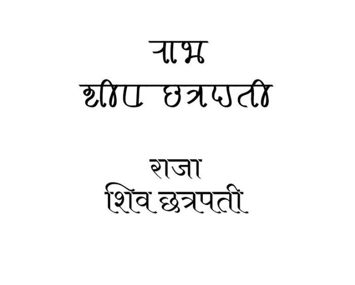
Pun is a play on words. Sometimes pun is fun. Sometimes it is risqué. Some times it has dirty meaning. It is considered to be a sign of wit. A mastery of puns is admirable. Is the person who makes a pun called a punner? And sin of making bad puns called punnery? It makes meaning not literal. It adds a layer of meaning to the words, which goes beyond the literal meaning. But why would anyone want that? If the author wants to convey some other meaning why not write that but go about it in a circuitous way? Not everyone can make sense of puns. Perhaps some puns are too clever for anyone to understand! Maybe all sentences are pun but they are beyond our cognitive capacities to understand them. Sometimes the pun goes unnoticed or sometimes it is feared that one might be construed when there is none. Then people say “Pun intended” or “Pun unintended?!” Intending a pun is easy but how does one not intend a pun? At what cognitive stage do humans start to understand and appreciate puns? Are puns present in all languages? But nonetheless there are bad puns and good puns and then there are dead puns.
When puns are killed, the resultant ceremony in its memory is a puneral. So a puneral is a funeral for puns. Sometimes puns are so bad that it is like murdering them in broad daylight. What are some examples? But is daylight always broad? I should say narrow night light? Or in medium twilight? Is light always needed for murder? How about a no light murder? Would it be heavy then?
News about murdering raisins is in the current affairs section of the paper.
Is this a bad pun? Does it qualify for a puneral?
But anyways. Puneral is the word to describe that event which is the procession for mourning the abuse of puns. It is just me coining new terms with some meaning and/or just writing some nonsense. Earlier I had coined cigol. Go fetch the meaning.
A Puneral Procession? – Owl and Pussycat by Edward Lear
But how would such a procession would look like? Can we at all visualise a puneral? Or it is an abstracted out event coming from nowhere and going to nowhere? Of no fixed address they say. But does a pun have an address? Is a pun always addressed to someone? Can a pun be self-reliant and self-referential? What if a pun commits a suicide? Or it commits a harakiri because it is ashamed at the sheer cheesiness of itself? What do grammar nazis feel about punerals? What about astute english professors? Sorry didn’t Capitalise the “E” in english? Was it intentional non-capitalisation? Does everything have intent? Is every stance intentional? Or is there random blabbering? (some might say just like this post! Is this a self referential sentence?) What can be other meanings of puneral? PUNE Roadways And Logistics? Keep guessing. Or is it PUNE feRAL for feral things in Pune?
Well, who knows about such things?
Another style that is often employed with the large capital letter is that the rest of the word, or the sentence is in small caps. Now small caps are distinct than the regular caps. They are capitals, but with the x-height of small letters. And small caps usually have slightly larger spacing between the words than the regular one.
RELATIVITY AND ITS ROOTS HOFFMAN 1983
The Night Thoughts of a Classical Physicist McCormmach 1982
The Pleasure of Text Barthes 1975
Now, even in some of the modern books the same effect is used. So if you are looking for a way to achieve this effect using LaTex, then lettrine is the package you are looking for.
Drop caps
The name of this effect is drop caps. When I was searching for finding a solution for achieving this effect, the first block was that I didn’t know what it was called! After a bit of searching here and there I finally came to know about the name: drop caps. So if you are stuck as I was about what this large capital letter style is called, thence the descriptive and verbose title of post.
Now back to LaTeX implementation. lettering gives you several options for customising the drop caps. For the simplest case, we can use the default font of the document
\usepackage{lettrine}
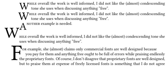
\lettrine{W}{hile} overall the work is well informed, I did not like the (almost) condescending tone she uses when discussing anything “free”.
\lettrine[lines=2,lhang=.1,loversize=0.1]{W}{hile} overall the work is well informed, I did not like the (almost) condescending tone she uses when discussing anything “free”.
\lettrine{A}{nother} example is needed.
\lettrine[lines=1,lhang=1,loversize=0.5]{W}{hile} overall the work is well informed, I did not like the (almost) condescending tone she uses when discussing anything “free”. \lettrine[lines=3,lhang=0.75,loversize=0.25]{F}{or} example, she (almost) claims only commercial fonts are well designed because
These examples produce the following output
Now we can also use fancy header fonts. Have a look at some of them here.
\newfontfamily\zallman[Scale=4]{ZallmanCaps}
\renewcommand*{\LettrineFont}{\zallman}
\newfontfamily\acorn[Scale=4.2]{AcornInitials}
\renewcommand*{\LettrineFont}{\acorn}
You will need to play with the parameters for different fonts to find a better fit for your document.
Now how to add colour?
\lettrine[lines=3]{\color{red}S}{tart}
\vspace{30pt}
\lettrine{\color{green}W}{hile} overall the work is well informed, I did not like the (almost) condescending tone she uses when discussing anything “free”.
\lettrine[lines=2,lhang=.1,loversize=0.1]{\color{blue}W}{hile} overall the work is well informed, I did not like the (almost) condescending tone she uses when discussing anything “free”.
Happy typesetting!
How the Leopard Changed it Spots by Brian Goodwin talks about a different approach to biology. After the genetic and molecular biology revolution 1950s onwards, increasingly the organism has been shifted out of focus in biology. Instead genes and their effect, genocentrism or neo-Darwninism, have taken the central stage. Everything in biology is seen as an “action” of genes in addition to natural selection. This translates to reductionism, everything is reduced to genes which are considered as the most fundamental units of life. This is the dominant approach in biology for some decades now. The terms such as “selfish gene” basically highlight this point. Such an approach sidelines the organism as a whole and its environment and highlights the genes alone. Good draws analogy of “word” of god seen as the final one in scriptures to the code alphabet in the genes, as if their actions and results are inevitable and immutable.
Goodwin in his work argues against such an approach using a complex systems perspective. In the process he also critiques what is an acceptable “explanation” in biology vis-a-vis other sciences. The explanation in biology typically is a historical one, in which features and processes are seen in the light of its inheritance and survival value of its properties. This “explanation” does not explain why certain forms are possible. Goodwin with examples establishes how action of genes alone cannot establish the form of the organism (morphogenesis). Genes only play one of the parts in morphogenesis, but are not solely responsible for it (which is how neo-Darwinist account argue). He cites examples from complex systems such as Belousov–Zhabotinsky reaction, ant colonies to establish the fact that in any system there are different levels of organisation. And there are phenomena, emergent phenomena, which cannot be predicted on the basis of the properties constituent parts alone. Simple interactions of components at lower level can give rise to (often) surprising properties at higher level. He is very clear that natural selection is universal (Darwin’s Dangerous Idea?!)
> What this makes clear is that there is nothing particularly biological about natural selection: it is simply a term used by biologists to describe the way in which one form replaces another as a result of their different dynamic properties. This is just a way of talking about dynamic stability, a concept used for a long time in physics and chemistry. We could, if we wished, simply replace the term natural selection with dynamic stabilization, the emergence of the stable states in a dynamic system. p. 53
Goodwin uses the term morphogenetic space to convey the possible shape space that an organism can occupy. Thus seen from a complex systems perspective, the various unit of the organism interact to generate the form of the organism. Natural selection then acts as a coarse sieve on these forms with respect to the environmental landscape. The “aim” of the organism is not the climb the fitness lanscape but to achieve dynamic stability.
> The relevant notion for the analysis of evolving systems is dynamic stability: A necessary (though by no means sufficient} condition for the survival of a species is that its life cycle be dynamically stable in a particular environment. This stability refers to the dynamics of the whole cycle, involving the whole organism as an integrated system that is itself integrated into a greater system, which is its habitat. p. 179
Goodwin takes examples of biological model systems and shows how using mathematical models we can generate their forms. Structure of acetabularia (a largish ~1 inch single cell algae), the structure of eye, the Fibonacci pattern seen in many flower structures being the main examples. Also, how the three basic forms of leaf arrangement can be generated by variations on a theme in the morphospace are discussed in detail. The model shows that three major forms are the most probable ones, which is actually substantiated by observations in nature. In these examples, an holistic approach is taken in which genes, competition and natural selection only play a part are not the main characters but are interacting and cooperating with levels of organisation of the organism, environmental factors in the drama of life.
> Competition has no special status in biological dynamics, where what is important is the pattern of relationships and interactions that exist and how they contribute to the behavior of the system as an integrated whole.The problem of origins requires an understanding of how new levels of order emerge from complex patterns of interaction and what the properties of these emergent structures are in terms of their robustness to perturbation and their capacity for self-maintenance. Then all levels of order and organization are recognized as equally important in understanding the behavior of living systems, and the reductionist insistence on some basic material level of cause and explanation, such as molecules and genes, can be recognized as an unfortunate fashion or prejudice that is actually bad science. P.181
Since I am already a believer of the complex systems perspective, I was aware of some of the arguments in this book, but the particular worked examples and their interpretation for biology was a fresh experience.
Science education should move away from rote and memory based approach. Science in the schools should be done primarily with hands, and be supported by building conceptual structures based on this experience. Ideas of science need concrete experiential basis. But any such approach to change how science is taught and learnt in the schools will be unsuccessful if we do not change the assessments methods and techniques.
Assessment in education is a horcrux to improve the education. Unless you make changes in assessments types and methods, the large scale picture of education is not going to change. All the efforts towards “improving” education have largely failed precisely because of this. As Papert commented decades ago, the educational system acts like a living organism that wants to maintain status quo. Any change in the fundamental processes such as classroom discourse, or teacher professional development must be accompanied by equivalent changes in the assessment techniques. Failing that the reforms will hit a block and if successful, will be very limited than the original objective. This is why I say assessment is like a horcrux, change the assessment type and patterns, the other systemic changes will follow.
For example, the teachers have been for several decades now being fed (forced?) with the agenda of using constructivism as an approach in their classroom teaching. The teacher training curricula has chapters on this very idea, with Piaget and Vygotsky being the buzzwords. (Whether constructivism is the best approach to teaching and learning is another question to be pondered. The fact remains that most academics accept by default that constructivism is the only way forward for better education.) So after learning all these theories, when it comes to actual classroom, these theories don’t mean much particularly in later grades. Because none of our assessments, particularly in the all important, life-defining, board exams are not constructivist in nature. Conversely, they are exemplars of rote-memory based assessments, in which replicating from memory in a given time frame is the most crucial quality that a learner can possess. So where do all the constructivist approaches go in the case of board exams? Are these exams even oriented to handle the constructivism based learning approach? They are not, hence all such reforms are doomed to fail. I call such reforms in school education as cosmetic reforms as they only change the appearance (in a limited way, and for limited people) rather than changing the educational approaches.
cosmetic | kɒzˈmɛtɪk | adjective: affecting only the appearance of something rather than its substance:
At most such cosmetic reforms create employment opportunities for educational researchers like myself, who bask in glory of research outputs such reforms create. Most of such research do not lead to any changes to implementation, but remain insulated and experimental cases which may not be scalable. Here one such idea is presented, might be too theoretical or not be scalable but worth sharing with others.
3R approach to science education – Record, Research, Report
The 4Rs of education are crucial, this idea is specific to science education which can be applied to other forms of education as well. But here it is presented in the context of science education. The basic idea is on project based learning in which the learners record (collect the data), research (analyse the data) and report the data back to their peer group. The choosing of the projects has to be done carefully so that there are natural variations in the implementation by different learners. It definitely should not be cookbook type projects in which everyone gets the same answer. The research questions for the project are hence important and can be akin to renewable assessments of Wiley. At the end of it they must lead to creation of something of value and interest to the learner, peers and community at large. It might be challenging to design such assessments, but then we are trying to change the overall approach to science education, cosmetic changes won’t work! Record: The data should be recorded providing details of how it was done, and if possible with access to raw data stored somewhere. Someone else might find that data useful. FAIR principles might of help to understand how’s and why’s of data sharing. Research: Analyse the data in the light of research questions, also some exploratory data analysis could be done. This might be an individual or a group task. Also interesting would be to look at how the learners work with data sets that have been created by others by incorporating them in their own research questions. Tools for analysis can be varied, and will depend on the type of research questions that are asked. Statistical analysis is only one part of research. Report: Science is a community based activity. Unless the data and findings from analysing it are shared with the peer community, it is not possible to call something science. The reporting might (should?) not be a research paper but should incrementally report the progress or any major Aha! moments. Such reporting will also help to create a history which the learner can see, and actually look at various aspects of learning. Reporting something might itself lead to learning about things, as writing is a higher form of cognitive activity. Reporting is also a form of error correcting mechanism, which might lead to deeper engagement with peers and the subject matter.
So a platform that is needed should suffice to cater to these three needs. And this is cyclical, with reporting leading to next questions, which need data to record -> research -> report -> record
Keeping these in mind I have created a logo for RRR which inherently describes a cyclical process of these three components. A learner sits in the centre, with an eye on a telescope like “r” for recording. Logo idea for Record, Research, Report
In your life there are some irritating characters. People who irritate you to no end. Maybe its their behavior, body language, or way they speak or dress. They just infuriate you and you cannot tolerate their presence. In case you cannot ask them to effoff, you just get the interaction with them over as soon as possible. Yet they persist.
Similarly, there are software applications which fit in this role of irritating characters. They bug you to do things which it (meaning the software designers) think is the “correct” way. One such crappy piece of software is the new “block editor” of wordpress. It is an application which irritates and interferes in the very process of writing a blog. Maybe there are people who like it, (to each their own). But I personally think the block editor is a cook book of how not to design software. Or Maybe I am too old to make new chic editors work well for me.
Every time it bugs you. Like a cheap salesman trying to sell his shitty wares to you. I am not sure why I can’t use the “classic editor” if I am more comfortable with it. Why is wordpress hell bent shoving this un-user friendly piece of software down to everyone’s posts? The block editor may have its advantages, but not for me. I prefer simple editor which allows me to focus on the writing instead of a menu popping every now and then which I have to click to dismiss. If I want a block I will call it, I don’t want the editor to push a block between me and my post. Block editor is defective by design in a way.
And there is no way you can turn it off unless you pay. WordPress perhaps knows this, that their editor is trash. Hence only with a hefty upgrade of “business” plan you can get it off your back by installing a “plugin” for classic editor, which should be there by default in the first place. This is akin to ransomware. You pay us or you continue to have shitty, sub-optimal experience with irritating pop-ups. Mind you I am not talking about completely free wordpress installation, it doesn’t even come with “personal” or “premium” plans so even with paid service they don’t want you to have any control over what editor you use.
So my workflow is now, to create a new post in “block editor”, then save a draft, return to the “All posts” and then continue with classic editor. Even then it continuously bugs you if I want to edit in the block editor, if I wanted to I would have, Now since I don’t want, can you please effoff and store this simple request of using classic editor next time?
No it won’t. Aren’t software designers at wordpress capable of understanding this simple request? Or they are doing it willingly to force people to move to their way however irritating and uncomfortable they are?
If wordpress even removes this support for classic editor, I will surely leave this platform and take my blog somewhere else. I was contemplating to leave it this year, but my lethargy prevented me from doing it. But then, lethargy has its limits and and so has patience in dealing with (purposefully) badly designed software applications and processes.
There are fonts and there are fonts. One of my earliest recollections of cognising that there are different “fonts” is from a typewritten letter I saw in my childhood (perhaps in the early-mid 90s). Though I didn’t know the term “font” then. Now I had seen typewritten materials earlier, as our exam papers were typewritten. But this said letter was somehow “different”. I didn’t know exactly what was different, but that letter and the typewritten text felt so elegant and aesthetic (again these words I didn’t know then, but trying to reconstruct my feelings from that time) as compared to the other typewritten documents that I had seen. The fact that I still remember that letter implies that it must have had some impact on my mind at that time. After that the printed “text” was never the same. I always tried to “see” the shapes of the text that I would read. Hence I “discovered” that the “fonts” in my school textbooks, and other books are different. I also discovered sans and serif in this way, but didn’t know the terms for them till a few years later. Thus began the journey to look at fonts keenly. Even with my handwriting, I developed 3-4 different scripts. None were cursive. I would play with the slant, then height of the letters, and my fountain pens did play the capable tools. With the computers came in plethora of fonts, more than you could count and keep track of. In the various image editing programmes the fonts achieve prime importance. A good font can make or break a document. It can render something mundane or render it to aesthetic appeal.
A good scientific question to think about is how does our cognitive system recognise that it is the same letter even if it is written in different fonts? Everyone’s handwriting is different even then (if they are legible) we can read and understand what they have written. This would imply that our cognitive system for recognising font faces as particular characters of language must be very very flexible. Any rigidity and we would not communicate. Douglas Hofstadter considers this very question in one of his essays Variations on a Theme as the Crux of Creativity in the Metamagical Themas (an anagram of “Mathematical Games” by Martin Gardner whose columns Hofstadter replaced) column in Scientific American. The compilation of the columns was later published as a book in 1985.
FIGURE 12-3. 56 As in different styles, all drawn from a recent Letraset catalogue. The names of their respective typefaces are given on the facing page. To native readers of the Latin alphabet, it is an almost immediate visual experience to recognize how any one of them is an ‘A’. No conscious processing is required. A couple of these seem far-fetched, but the rest are quite obvious. The most canonical of all 56 is probably Univers (D-3). Note that no single feature, such as having a pointed top or a horizontal crossbar (or even a crossbar at all!) is reliable. Even being open at the bottom is unreliable. What is going on here? p. 243
Hence we have more and more fonts. Some very legible and some not so much.
Though I never somehow liked Times New Roman or Arial, which arguably might be the most popular fonts in documents (how do you find out the most used font?). Might be because they are default fonts on MS Word. One of my earliest, serious documents that I had to prepare on the computer was the project report of my bachelors programme. I did use MS Word, but the font used was Bookman Old Style. And the document did look different than the rest.
I did have a lot of fonts at that point. I installed all fonts that I could get my hands on. Remember this is early 2000, finding free resources on the internet was not easy, and downloading and getting them to your computer was even a bigger an issue (particularly large files). I owe to Viktor Juliet Papa most of my computer knowledge. Because of his mentoring I could muster guts to take out my HDD to cafe where he was the manager, to get downloaded stuff back. (Again only, portable data transfer devices were 3.5 inch floppy drives with 1.44 MB memory. Good luck with transferring 100s of MBs!, my main disk was 8G for reference) So much to risk, but no risk no gain.
Then in that summer during my internship at the University, I discovered LaTeX. And Computer Modern. It looked sooo elegant compared to TNR or Arial. And it had all the mathematical symbols too. At that point, you had to edit the tex file separately, and then compile it via terminal. It would produce a dvi file, which you would convert to postscript via dvi2ps, and then to pdf via ps2pdf. But it was all worth it! The output was divine compared to plebian MS Word. They say LaTeX doesn’t work well for people who have sold their souls! So my report for masters just two years later was in LaTeX. And I never switched back for most serious documents.
In the earliest days, there were very limited fonts in LaTeX. But with packages like XeLaTeX and LuaLaTeX you can use any system fonts in your documents, including non-Roman scripts also. Now there are native packages also which have a variety of fonts. So in my PhD I used Linux Libertine as the main font and associated Linux Biolinum as the Sans font. Wikipedia logo uses Linux Libertine.
Now with libertinus package you can use it with pdfLaTeX, no need to use XeLaTeX/LuaLaTeX (though some might find this step regressive). The font comes with full math support, so that you can write the documents seamlessly.
Another nice set of fonts with full math support are kpfonts. Though I do not personally like the default sans that is bundled with it.
And one of the more elegant math fonts is urw-garamond, garamondx with mathdesign. Though this set has licensing restrictions that you may not like.
Some of the other sans fonts that I do use often are GeoSans Light, Comfortaa and Josefin Sans.
For fixed width fonts, Latin Modern and Inconsolata, TeX Gyre Cursor are used. See the programming fonts in the list below
For handwriting effect there are several nice fonts that I have used. The best ones are Purisa, Comili
New fonts will be continually developed. And for me fonts being free (as in freedom) is the most significant aspect. Given this there is a large number of fonts which have been released under GPL, OFL and similar open licenses. Fonts released GPL license come with the font exception. Below is a partial list of free (as in freedom) fonts which you can browse to get the font for your needs (though some might have non-free content). The listing is alphabetical Arkandis Digital Foundry Not updated since 2015, but has nice fonts
Font Library (a largish list of Free Fonts with various licenses)
Google Fonts Several nice fonts, in different scripts too.
LaTeX Font Catalog contains OTF and TTF files as well, my go to site for choosing LaTeX fonts
For a particular project, I had a requirement that the text be coloured as well as underlined. Now making text underlined in LaTeX has a default support in the form of \underline{text}, which simply produces an underlined text.
But what if you want to customise the underlining, for example, change the thickness of the underline, or its distance from the text baseline. Or simply you might want to have a different colour for the underline. There are several packages which allow you to customise this exact requirement.
For the present post I will choose the soul package which has some other goodies for typesetting as well. You can load the package with \usepackage{soul} Along with underlining, you have have strikeout and highlight. To setup the underline, soul package gives three options, underline depth, underline thickness and underline colour (page 12-13 of the package documentation).
You can set this in the preamble
\setul{⟨underline depth⟩}{⟨underline thickness⟩}
It is recommended that the units of these lengths are in ex, so that they are relative to the font size. For example,
\setul{0.3ex}{0.1ex}
To use it in the document \ul{underlined text} will produce
Another option is to set the colour of the underline. This can be done with
\setulcolor{gray}
With this option, the above code will look like
The color option can be changed anywhere in the document, so you can have change of colours as required. Defining in the preamble has a universal effect.
So far so good. Now in this case I wanted the underlined text to be of different colour. For this one can define a newcommand with text colour option.
A photo taken at eye of the Mooi River. I wish I had taken perhaps hundreds of photos, but alas I have only a few.
Whenever I go to an interesting place or look at something interesting, I try to take photos. Though recently in last couple of years this has gone down a bit. But now that I have a camera phone, I try to make up for it. When I am in the process of taking photos, I try to take as many angles and frames as possible. And at that time, it seems whatever photos I have taken are enough or sometimes even think that they are more than sufficient. All the angles and frames are covered. I try to take macro shots if its an object, and some full frame shots. And I am actually satisfied with the quality and quantity of the photos at that moment. And I smugly leave subjecting that subject to further assaults of the camera lens.
But then, when I look at the photos again, I realise that I have taken too few! I then realise a few more photos could have been better, maybe this frame or this angle is missing. And then I despair. While it would have made sense in the era of film cameras, to conserve the film, in the era of the digital, the preview makes it possible for us to delete something which was not good. So you can spend slightly more on experimenting with the photos. But alas, I still have hard time convincing myself that I have not taken enough photos, and always end up taking too few..
This is an interesting account of Nagpur state from late eighteenth century. It is part of a small book titled Journal Of A Route To Nagpore by Daniel Robinson Leckie. I have taken some liberty to replace the long s typeset as f with regular s. For example, coft is cost. Some of the names are in archaic English but one can make sense of the them. For example Peshwa is Paishwah. This account shows the extent of the Rajah of Nagpore’s territories as well as some peculiarities of the region. Some of the places that are mentioned are the fortifications, palace, Jumma Talao, Sakkardarah etc. The account also has a short, somewhat incorrect, history of the house of the Bhoslas. Leckie says the Nagpur Bhoslas were descended from Shivaji’s house which clearly was not the case. Also there are remarks on the current affairs of the Nagpur state with the Peshwa in Pune and Chatrapati in Satara.
ACCOUNT OF NAGPORE,
&c. &c.
NAGPORE, situated in 79º 46′ east longitude from Greenwich, and 21º 49′ north latitude, is the present capital of Gondwauna1, a name little known to Europeans, perhaps owing to the remote situation of it from our settlements, and the Rauj2 of that name having been dismembered before we possessed any territory in India, at which time the comparatively confined state of the affairs of the Company did not lead to geographical inquiries.
I have taken no small degree of pains to ascertain the boundaries of Gondwauna; and though I will not pretend to say that the information I have procured is in every respect: exact, yet it may serve to give a general idea of the extent of the country.
It is not amiss to observe, that the people of this place are by no means communicative, and very circumspedt in giving information, particularly to Europeans, and it has cost me no small degree of trouble to collect what trifling information this account contains.
Gondwauna is bounded on the north-east; by an imaginary line, drawn from the town of Belhare to the city of Ruttunpoor; on the south-east by such another imaginary line, drawn from Ruttunpoor through the village of Soormul (situated about five coss to the north-east of Nurrah, which last is laid down in the map), to the junction of the Oordah and Beingunga rivers; on the south-wedt by the Oordah (Wadha) river; and pn the north-east by that chain of mountains which separates it from Malwa.
When Gondwauna was partly reduced by Aulumgwer, he obliged a great number of the natives together with the Rajah, to embrace the Mahomedan religion ; and the country remained for a series of years in this situation, the Rajah paying a fort of homage to the Moghul, as lord paramount : when, in the beginning of the present century, Ragojee Bhooshla, descended from the great Sevagi, reduced the greatest part of Gondwauna, to the south of the Nurbudda, with the province of Berar. The lenity with which he treated the Gonde Rajah deserves particular mention, as it shows a trait of humanity in the Merhattahs worthy of the highest pitch of civilization. He not only abstained from all forts of personal violence, but allotted three lachs of rupees annually for the Gonde Rajah’s maintenance, and the fort for him to live in, by no means as a confinement. Burhaun Shah, the son of the conquered Rajah, has still handsome allowances, and the fort to live in ; and the confidence which the late Moodajee placed in him was great: for what could be a greater mark of it in the East, than putting his family and women under his charge when he went upon any warlike expedition? which he constantly did.
Ragojee was the founder of Nagpore, which he surrounded with a rampart, it being only an insignificant village appertaining to the fort prior to his capture of it. It is situated oh a high plain, is richly cultivated, and produces fine wheat, and bounded by hills to the north- west and south. The Nag Nudde, a rivulet running to the southward, gives name to the town.
The houses are generally meanly built and covered with tiles, and the streets are narrow and filthy. The only good building is the palace, begun by the late Moodajee, and now finishing by his fon, the present Rajah ; it is built of a blue done dug out of a quarry in large blocks on the western skirts of the town. The present Rajah, however, has destroyed the grand effect which would have been produced by the stone alone, by intermixing brick-work in the building. There is a very large and deep3 tank near the west gate, called Jumma Tallow, three sides of which are handsomely built up with masonry ; and the Rajah has a foundery to the southward of the town, called Shukerderri, where he calls tolerably good brass guns. There, with some few gardens of the Rajah’s, neatly laid out in walks planted with cypress-trees, and interspersed with fountains, are the only places of note at Nagpore.
It should appear that Major Rennell (Memoir, second edition, 4to. page 12) is not perfectly clear with regard to the idea he has formed of the Merhattah state, that all the chiefs owe a fort of obedience to the Paishwah, resembling that of the German Princes to the Emperor. The account I heard from the Dewaun4 in the Durbar5 was,
But the fine extensive country which the Paishwah occupies, together with the advantage of playing the Sattarah puppet, will always give him influence with the other chiefs.
“That there is a person whom they call the representative of the Rauj, who is kept in the fort of Sattarah, and he is treated with all imaginable respect when he makes his appearance at Poonah, which is only upon particular occassions ; and when at Sattarah he is supplied with every luxury, and magnificently attended. On the demise of this image of government the handsome son of some poor man is chosen to supply his room. The Paishwah is prime minister to the Merhattah state; the Rajah of Nagpore, &c. commander in chief of the armies ; and they, as well as the rest of the chiefs, call themselves. servants of the Rauj; and none acknowledges the least immediate authority of the Paishwah, but they are all bound in cafes of necessity to render mutual assistance to each other, for the public good of the constitution.’’
The present Rajah, Rogojee Bhooshla, the grandson of the Conqueror (Ragojee the first was succeeded by his eldest son, Jannojee who was succeeded by his brother Sabage, who was slain in battle by Moodajee, the father of the. present Rajah. I have not the particulars their histories) does not seem to be either adapted to civil or military business ; he is generally dressed plainly in white, but wears costly diamonds and pearls; his behaviour is courteous to strangers. His great penchant is for elephants and mares. He has about 200 of the former, the finest; I ever beheld; and they are fed so sumptuously with sugar-cane, treacle, ghee, &c.. and not unfrequently fowl pallow, that they become almost mad with lust, breaking their chains and doing great mischief, which is considered by the Merhattahs as fine sport. The principal people about the Rajah are, his brother, Munnea Bapoo, a very quiet young man; Bhowaunny Caulloo, the Dewaun, a shrewd old fellow, and his nephew, Pondrang, the commander and paymaster of the army; Siree Dhur, the Monshee; and Mahadajee Leshkery, the Rajah’s confident, who is consulted on all occasions.
The Rajah does not keep up above 10,000 horse, the pay of which, as is the custom among all native princes, is irregularly distributed. He has two battalions of Sepoys, armed and clothed like ours ; and although they have been drilled by black officers, formerly belonging either to the Nabob of Lucknow, or our service, yet they go through their exercise very badly, and I do not think they will be able to make a stand against any body of native Sepoys disciplined by European officers.
I have heard that the total collections of the Rajah’s dominions, including Ruttunpore and Cuttae, only amount to seventy lacks of rupees per annum. I will not, however, pretend to affirm that this is exact though I do not think it can much exceed that sum; for the Rajah’s country, notwithstanding the great extent of it, does not contain a proportionable quantity of cultivated land to that which is waste and occupied by forests.
It is generally supposed that Nagpore is the capital of Berar. This is evidently a mistake. The inhabitants of Nagpore talk relatively of Berar as an adjoining province, as we do of Bahar to Bengal; and it has been shown that Nagpore is a city of late date. Elichpour is the capital of Berar, by the accounts I have received from the natives, who represent it as a very ancient city, and much larger than Nagpore.
A custom prevails in this town, which I cannot forbear taking notice of, because it serves to prove that long usage will give a plausibility to things seemingly the most preposterous. The bramins and best people at Nagpore have women attendants upon their families, whom they breed up from their childhood, and are called Butkies, or Slauls. They attend on their masters and mistresses during the day-time, and are permitted to go to any man they please in the night; some of them become very rich, and they are in general very handsome, fine women.
Looking at this vast natural drama from their observation posts on the minute planet Earth as it revolves around the insignificant star called the sun, a handful of astronomers seek to gain an understanding of the cosmos. Using instruments constructed from materials found on their planet, they follow the activities in space from their observatories and launch rocket-borne telescopes from Earth. Some people confuse them with astrologers, but astronomers reject all such notions of kinship; others look up to them because their thoughts and ideas move in realms beyond the imagination of those of us engaged in everyday activities. Their work brings them a step closer to creation, at least to the creation of the uninhabited world, but they are sober scientists who do not attempt to adduce ethical norms from the phenomena they observe. Their involvement with cosmic matters does not make them better human beings. They are not motivated solely by a dedication to greater knowledge. As is true of other segments of human society, thoughts of competition and career advancement enter into their calculations; quite a few discoveries grew out of just such considerations. Yet this is not to deny, as we shall learn, that we find among them a passion for knowledge and much friendly cooperation. The fruit of their research is the work of human beings and as such is often imperfect, even erroneous. But despite setbacks the course of the science of astronomy, beginning with the Babylonians and culminating in modern astrophysics, has led ever forward.